15 Control Panels
Control panels are essentially custom-built property panels that are attached to the root model and let the user interactively set or adjust various properties while the simulation is in progress. Most of the panels that appear with the various ArtiSynth demos are in fact control panels specially created for the demo in question.
The properties controlled by a control panel do not need to come from the same object; instead, they can come from a variety of objects. However, unlike with property panels, it is not possible (at the time of this writing) for a control panel widget to control a property across multiple objects.
The problem of controlling the same property in multiple objects may be addressed in future by the introduction of component groups.
15.1 Creating control panels
To create a control panel, select Edit > Add control panel from the ArtiSynth main menu. This will cause a blank control panel to appear.
To add a widget to this panel, right-click inside the the panel and select Add widget. This will cause a widget creation dialog to appear, as shown in Figure 66.
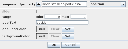
The top-most widget in this dialog is a component/property selector. The component section is a selection display identical in function to that described in Section 4.4: the path of the most recently selected component is displayed, and its parent may be selected by clicking on the “up” button at the left. If no component is selected, you will need to select one using the navigation panel or the viewer. Once a component is selected, the combination box on the right will provide a selection of properties that may be selected for the widget. Once a property is selected, other options in the dialog may be used to tune the appearance of the widget:
- slider
-
Enabled for properties with a scalar numeric value. Setting it to true will create a widget with a slider.
- range
-
Specifies the range for the slider, if one is selected.
- labelText
-
The name of the widget in the panel. By default, this is the name of the property.
- labelFontColor
-
Font color for the widget name. If null, then the default color is used.
- backgroundColor
-
Background color for the widget. If null, then the default background is used.
15.1.1 Composite property widgets
A CompositeProperty is a Property which contains subproperties (see the “Composite Properties” section of the Maspack Reference Manual).
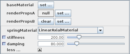
If a composite property is selected, the control panel will create a composite property widget, the exact form of which depends on the composite property. Figure 67 shows a control panel containing four composite property widgets for the properties baseMaterial, renderPropsA, renderPropsB, and springMaterial.
The default composite property widget appears as a single set button, labeled as ”set ...”, and is illustrated by the widget for baseMaterial in Figure 67. Clicking the set button opens another property panel that allows the subproperties of the composite property to be set.
If the composite property is allowed to have a null value, then this is controlled by an additional null button that precedes the set button. If the current property value is null, then the null button will display null (as illustrated by the widget for renderPropsA in Figure 67), and clicking the set button will create a new composite property instance that will replace the null value. Otherwise, if the current property value is non-null, then the null button will display clear (as illustrated by the widget for renderPropsB in Figure 67), and hitting it will set the current property value to null.
Finally, if the composite property has subclasses, and the types of these are exported by the static method
in the property’s class definition, then the composite property widget takes the form of a composite property panel, which instead of using a set button, expands all the subproperties inline within a subpanel of the control panel, together with a combination box that allows different subclass instances to be set. This is illustrated for the property springMaterial in Figure 67, where the composite property is an AxialMaterial, which has a number of subclasses, including LinearAxialMaterial which is currently selected in the figure. Different subclass instances may have different subproperties, and the subpanel is updated to reflect these when the subclass is changed. In order to help the control panel save space, the subpanel can also be expanded or collapsed using a more/less button at its bottom.
15.1.2 Widgets for subproperties
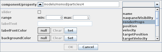
It is possible to attach widgets to the subproperties of a composite property, provided that the composite property has a non-null value.
In particular, when a non-null composite property is selected from the component/property widget, the user has the option of either
-
•
clicking the Done button and selecting the composite property, which will create a composite property widget as described in the previous section, or
-
•
selecting one of the composite property’s subproperties.
When a non-null composite property is selected, the property’s name will move over into the component field of the component/property selector, and the combination box will be cleared and reset to allow the selection of the subproperties.
 |
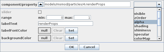 |
For example, in Figure 68, we first select renderProps, which is a composite property of models/msmod/particle/2, and then (in the lower panel) select the sub-property visible. When renderProps is selected, its name is moved to the component panel, where it appears as
models/msmod/particle/2:renderProps
Note:
The ‘:’ character is used to separate components from properties in component/property paths
15.2 Editing control panels
An existing control panel can also be edited. Specifically,
-
•
Individual widgets can be moved, deleted, or have their properties set.
-
•
Separators can be added between widgets.
-
•
Global aspects of the control panel itself can be set.
To edit an individual widget, you first select it by left-clicking on it. This will cause it to become highlighted. You can then:
-
•
Move the widget by dragging it to a different vertical location within the panel;
-
•
Delete the widget by right-clicking and choosing delete;
-
•
Set properties of the widget by right-clicking and choosing properties;
To add a separator, select a widget above where you want the separator, right-click and choose add separator.
To set global aspects of the control panel itself, right-click inside the lower-most option pane (the small panel at the bottom and that may, in some cases, contain option buttons such as Close or Done), and choose from the provided menu.
15.3 Live updating
By default, a control panel is set up to update the values of its widgets every time the viewers are rerendered. This allows one to observe property values as they evolve in time.
If you do not want live updating of property values, then you can
disable this by clicking on the live update icon
 , which is located in the lower left of the
option panel.
, which is located in the lower left of the
option panel.
15.4 Selecting property components
Double-clicking (using the left mouse button) on the label of a control panel widget will cause the component hosting that widget’s property to be selected. The path of the selected component will appear in the selection display beneath the viewer (Section 4.4), and a context menu can be invoked for the component by right-clicking (or equivalent) within the viewer itself.
![[LOGO]](data:image/png;base64,iVBORw0KGgoAAAANSUhEUgAAAAsAAAAOCAYAAAD5YeaVAAAAAXNSR0IArs4c6QAAAAZiS0dEAP8A/wD/oL2nkwAAAAlwSFlzAAALEwAACxMBAJqcGAAAAAd0SU1FB9wKExQZLWTEaOUAAAAddEVYdENvbW1lbnQAQ3JlYXRlZCB3aXRoIFRoZSBHSU1Q72QlbgAAAdpJREFUKM9tkL+L2nAARz9fPZNCKFapUn8kyI0e4iRHSR1Kb8ng0lJw6FYHFwv2LwhOpcWxTjeUunYqOmqd6hEoRDhtDWdA8ApRYsSUCDHNt5ul13vz4w0vWCgUnnEc975arX6ORqN3VqtVZbfbTQC4uEHANM3jSqXymFI6yWazP2KxWAXAL9zCUa1Wy2tXVxheKA9YNoR8Pt+aTqe4FVVVvz05O6MBhqUIBGk8Hn8HAOVy+T+XLJfLS4ZhTiRJgqIoVBRFIoric47jPnmeB1mW/9rr9ZpSSn3Lsmir1fJZlqWlUonKsvwWwD8ymc/nXwVBeLjf7xEKhdBut9Hr9WgmkyGEkJwsy5eHG5vN5g0AKIoCAEgkEkin0wQAfN9/cXPdheu6P33fBwB4ngcAcByHJpPJl+fn54mD3Gg0NrquXxeLRQAAwzAYj8cwTZPwPH9/sVg8PXweDAauqqr2cDjEer1GJBLBZDJBs9mE4zjwfZ85lAGg2+06hmGgXq+j3+/DsixYlgVN03a9Xu8jgCNCyIegIAgx13Vfd7vdu+FweG8YRkjXdWy329+dTgeSJD3ieZ7RNO0VAXAPwDEAO5VKndi2fWrb9jWl9Esul6PZbDY9Go1OZ7PZ9z/lyuD3OozU2wAAAABJRU5ErkJggg==)