5.1 Control Panels
A control panel is an editing panel that allows for the interactive adjustment of component properties.
It is always possible to adjust component properties through the GUI by selecting one or more components and then choosing Edit properties ... in the right-click context menu. However, it may be tedious to repeatedly select the required components, and the resulting panels present the user with all properties common to the selection. A control panel allows an application to provide a customized editing panel for selected properties.
If an application wishes to adjust an attribute that is not exported as a property of some ArtiSynth component, it is often possible to create a custom property for the attribute in question. Custom properties are described in Section 5.2.
5.1.1 General principles
Control panels are implemented by the ControlPanel model component. They can be set up within a model’s build() method by creating an instance of ControlPanel, populating it with widgets for editing the desired properties, and then adding it to the root model using the latter’s addControlPanel() method. A typical code sequence looks like this:
There are various addWidget() methods available for adding widgets and components to a control panel. Two of the most commonly used are:
The first method creates a widget to control the property located by propPath with respect to the property’s host (which is usually a model component or a composite property). Property paths are discussed in Section 1.4.2, and can consist of a simple property name, a composite property name, or, for properties located in descendant components, a component path followed by a colon ‘:’ and then a simple or compound property name.
The second method creates a slider widget to control a property whose value is a single number, with an initial numeric range given by max and min.
The first method will also create a slider widget for a property whose value is a number, if the property has a default range and slider widgets are not disabled in the property’s declaration. However, the second method allows the slider range to be explicitly specified.
Both methods also return the widget component itself, which is an instance of LabeledComponentBase, and assign the widget a text label that is the same as the property’s name. In some situations, it is useful to assign a different text label (such as when creating two widgets to control the same property in two different components). For those cases, the methods
allow the widget’s text label to be explicitly specified.
Sometimes, it is desirable to create a widget that controls that same property across two or more host components (as illustrated in Section 5.1.3 below). For that, the methods
allow multiple hosts to be specified using the variable length argument list hosts.
Other flavors of addWidget() also exist, as described in the API documentation for ControlPanel. In particular, any type of Swing or awt component can be added using the method
Control panels can also be created interactively using the GUI; see the section “Control Panels” in the ArtiSynth User Interface Guide.
5.1.2 Example: Creating a simple control panel
An application model showing a control panel is defined in
artisynth.demos.tutorial.SimpleMuscleWithPanel
This model simply extends SimpleMuscle (Section 4.5.2) to provide a control panel for adjusting gravity, the mass and color of the box, and the muscle excitation. The class definition, excluding import statements, is shown below:
The build() method calls super.build() to create the model used by SimpleMuscle. It then proceeds to create a ControlPanel, populate it with widgets, and add it to the root model (lines 8-15). The panel is given the name "controls" in the constructor (line 8); this is its component name and is also used as the title for the panel’s window frame. A control panel does not need to be named, but if it is, then that name must be unique among the control panels.
Lines 9-11 create widgets for three properties located relative to the MechModel referenced by mech. The first is the MechModel’s gravity. The second is the mass of the box, which is a component located relative to mech by the path name (Section 1.1.5) "rigidBodies/box". The third is the box’s face color, which is the sub-property faceColor of the box’s renderProps property.
Line 12 adds a JSeparator to the panel, using the addWidget() method that accepts general components, and line 13 adds a widget to control the excitation property for muscle.
It should be noted that there are different ways to specify target properties in addWidget(). First, component paths may contain numbers instead of names, and so the box’s mass property could be specified using "rigidBodies/0:mass" instead of "rigidBodies/box:mass" since the box’s number is 0. Second, if a reference to a subcomponent is available, one can specify properties directly with respect to that, instead of indicating the subcomponent in the property path. For example, if the box was referenced by a variable body, then one could use the construction
panel.addWidget (body, "mass");in place of
panel.addWidget (mech, "rigidBodies/box:mass");
To run this example in ArtiSynth, select All demos > tutorial > SimpleMuscleWithPanel from the Models menu. The demo will appear with the control panel shown in Figure 5.1, allowing the displayed properties to be adjusted interactively by the user while the model is either stationary or running.
Double-clicking (using the left mouse button) on the label of a control panel widget will cause the component hosting that widget’s property to be selected. The path of the selected component will appear in the selection display beneath the viewer (see the section “Selection display” in the ArtiSynth User Interface Guide), and a context menu can be invoked for the component by right-clicking (or equivalent) within the viewer itself.
As described in Section 1.4.3, some properties are inheritable, meaning that their values can either be set explicitly within their host component, or inherited from the equivalent property in an ancestor component. Widgets for inheritable properties include an icon in the left margin indicating whether the value is explicitly set (square icon) or inherited from an ancestor (triangular icon) (Figure 5.1). These settings can be toggled by clicking on the icon. Changing an explicit setting to inherited will cause the property’s value to be changed to that of the nearest ancestor component, or to the property’s default value if no ancestor component contains an equivalent property.
5.1.3 Example: Controlling properties in multiple components
It is sometimes useful to create a property widget that adjusts the same property across several different components at the same time. This can be done using the addWidget() methods that accept multiple hosts. An application model demonstrating this is defined in
artisynth.demos.tutorial.ControlPanelDemo
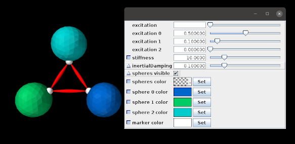
and shown in Figure 5.2. The model creates a simple arrangement of three spheres, connected by point-to-point muscles and with collisions enabled (Chapter 8), whose dynamic behavior can be adjusted using the control panel. Selected rendering properties can also be changed using the panel. The class definition, excluding import statements, is shown below:
First, a MechModel is created with zero gravity and a default inertialDamping of 0.1 (lines 18-21). Next, three spheres are created, each with a different color and a frame marker attached to the top. These are positioned around the world coordinate origin, and oriented with their tops pointing toward the origin (lines 26-47), allowing them to be connected, via their markers, with three simple muscles (lines 49-52) created using the support method attachMuscle() (lines 8-14). Collisions (Chapter 8) are then enabled between all spheres (line 55).
At lines 62-64, we explicitly set the render properties for each marker; this is done because marker render properties are null by default and hence need to be explicitly set to enable widgets to be created for them, as discussed further below.
Finally, a control panel is created for various dynamic and rendering properties. These include the excitation and material stiffness for all muscles (lines 71 and 75); the inertialDamping, rendering visibility and faceColor for all spheres (lines 77, 79, and 81); and the rendering pointColor for all markers (line 85). The panel also allows muscle excitations and sphere face colors to be set individually (lines 72-74 and 82-84). Some of the addWidget() calls explicitly set the label text for their widgets. For example, those controlling individual muscle excitations are labeled as “excitation 0”, “excitation 1”, and “excitation 2” to denote their associated muscle.
Some widgets are created for subproperties of their components (e.g., material.stiffness and renderProps.faceColor). The following caveats apply in these cases:
-
1.
The parent property (e.g., renderProps for renderProps.faceColor) must be present in the component. While this will generally be true, in some instances the parent property may have a default value of null, and must be explicitly set to a non-null value before the widget is created (otherwise the subproperty will not be found and the widget creation will fail). This most commonly occurs for the renderProps property of smaller components, like particles and markers; in the example, render properties are explicitly assigned to the markers at lines 62-64.
-
2.
If the parent property is changed for a particular host, then the widget will no longer be able to access the subproperty. For instance, in the example, if the material property for a muscle is changed (via either code or the GUI), then the widget controlling material.stiffness will no longer be able to access the stiffness subproperty for that muscle.
To run this example in ArtiSynth, select All demos > tutorial > ControlPanelDemo from the Models menu. When the model is run, the spheres will start to be drawn together by the muscles’ intrinsic stiffness. Setting non-zero excitation values in the control panel will increase the attraction, while setting stiffness values will likewise affect the dynamics. The panel can also be used to make all the spheres invisible, or to change their colors, either separately or collectively.
When a single widget is used to control a property across multiple host components, the property’s value may not be the same for those components. When this occurs, the widget’s value field displays either blank space (for numeric, string and enum values), a “?” (for boolean values), or a checked pattern (for color values). This is illustrated in Figure 5.2 for the “excitation” and “spheres color” widgets, since their individual values differ.
5.1.4 Coordinate panels
A special subclass of ControlPanel is a CoordinatePanel, which supports the addition of widgets for controlling joint coordinate values. A CoordinatePanel is associated with the MechModel containing the coordinates’ joints. When a coordinate value changes, the MechModel is used to update other model components that may be affected, such as the wrap paths for MultiPointSprings and the locations of attached components.
At present, CoordinatePanels do not take into account couplings between coordinate values that may be induced by kinematic loops within the model. This will be remedied in the future.
A CoordinatePanel may be created with the constructor
| CoordinatePanel (String name, MechModel mech) |
which assigns it a name and MechModel. Coordinate widgets may then be added using a variety of methods:
The first three methods create a coordinate widget for a given joint, with the coordinate itself specified by either its name (cname) or index (cidx). For the third method, the widget’s label can be set explicitly; if label is null, or unspecified as in the other methods, then a label is generated from the coordinate’s name. The next four methods specify the coordinate using a JointCoordinateHandle, which encapsulates both a coordinate’s joint and index information and can be constructed easily as follows:
Some of these methods also allow the widget’s value range to be explicitly set via the arguments min and max. The final method, addCoordinateWidgets() adds widgets for every coordinate within the specified joint.
These methods return CoordinateWidget, which is a subclass of DoubleFieldSlider. Other types of widgets may be added to a CoordinatePanel using the addWidget() methods inherited from ControlPanel.
CoordinatePanel widgets represent their values for revolute coordinates in degrees.
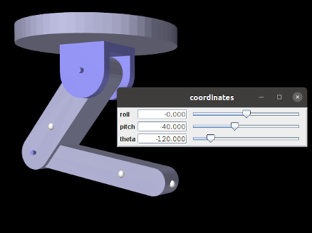
When added to the example MultiJointedArm (Section 3.5.16), the following code fragment creates the coordinate panel shown in Figure 5.3:
Double-clicking (using the left mouse button) on the label of a coordinate widget will cause the joint associated with that coordinate to be selected. The joint’s component path will appear in the selection display beneath the viewer, and a context menu can be invoked by right-clicking (or equivalent) within the viewer itself. Choosing “Edit properties ...” from the context menu will create a property dialog for the joint, allowing other coordinate properties, such as its range and whether or not it is locked, to be set.
5.1.4.1 Panel settings
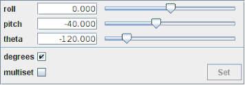
Once a coordinate panel is created, an application can use the method addSettingsPanel() to add a subpanel that controls the panel’s behavior:
The panel, shown in Figure 5.4, controls the following behavior settings:
-
•
Degrees: Sets whether values for rotary coordinates are expressed in degrees. The default setting is true.
-
•
Multiset: If true, changing the widget values does not change the underlying coordinates until the panel’s Set button is clicked, at which point all change requests are applied at once. This allows multiple coordinate values to be set simultaneously.
The degrees setting can also be controlled in code using the methods
| boolean getUseDegrees() |
Queries use of degrees for rotary coordinates. |
| void setUseDegrees (boolean enable) |
Sets use of degrees for rotary coordinates. |
5.1.4.2 Coordinate setting methods
For convenience, CoordinatePanel offers access to its underlying CoordinateSetter, together with wrapper methods to set or get coordinate values based on the widget label:
| CoordinateSetter getCoordinateSetter() |
Get the underlying coordinate setter. |
| double getCoordinate (String label) |
Get value by widget label (radians for rotary coords). |
| SetStatus setCoordinate (String label, double val) |
Set value by widget label (radians for rotary coords). |
| double getCoordinateDeg (String label) |
Get value by widget label (degrees for rotary coords). |
| SetStatus setCoordinateDeg (String label, double val) |
Set value by widget label (degrees for rotary coords). |
| void setRequest (String label, double val) |
Request set by widget label (radians for rotary coords). |
| void setRequestDeg (String label, double val) |
Request set by widget label (degrees for rotary coords). |
| SetStatus setCoordinates () |
Apply all set requests. |
![[LOGO]](data:image/png;base64,iVBORw0KGgoAAAANSUhEUgAAAAsAAAAOCAYAAAD5YeaVAAAAAXNSR0IArs4c6QAAAAZiS0dEAP8A/wD/oL2nkwAAAAlwSFlzAAALEwAACxMBAJqcGAAAAAd0SU1FB9wKExQZLWTEaOUAAAAddEVYdENvbW1lbnQAQ3JlYXRlZCB3aXRoIFRoZSBHSU1Q72QlbgAAAdpJREFUKM9tkL+L2nAARz9fPZNCKFapUn8kyI0e4iRHSR1Kb8ng0lJw6FYHFwv2LwhOpcWxTjeUunYqOmqd6hEoRDhtDWdA8ApRYsSUCDHNt5ul13vz4w0vWCgUnnEc975arX6ORqN3VqtVZbfbTQC4uEHANM3jSqXymFI6yWazP2KxWAXAL9zCUa1Wy2tXVxheKA9YNoR8Pt+aTqe4FVVVvz05O6MBhqUIBGk8Hn8HAOVy+T+XLJfLS4ZhTiRJgqIoVBRFIoric47jPnmeB1mW/9rr9ZpSSn3Lsmir1fJZlqWlUonKsvwWwD8ymc/nXwVBeLjf7xEKhdBut9Hr9WgmkyGEkJwsy5eHG5vN5g0AKIoCAEgkEkin0wQAfN9/cXPdheu6P33fBwB4ngcAcByHJpPJl+fn54mD3Gg0NrquXxeLRQAAwzAYj8cwTZPwPH9/sVg8PXweDAauqqr2cDjEer1GJBLBZDJBs9mE4zjwfZ85lAGg2+06hmGgXq+j3+/DsixYlgVN03a9Xu8jgCNCyIegIAgx13Vfd7vdu+FweG8YRkjXdWy329+dTgeSJD3ieZ7RNO0VAXAPwDEAO5VKndi2fWrb9jWl9Esul6PZbDY9Go1OZ7PZ9z/lyuD3OozU2wAAAABJRU5ErkJggg==)