ArtiSynth User Interface Guide
Last update: Nov 23, 2017
Contents:
- 1 Introduction
- 2 Loading and Simulating Models
- 3 The Viewer
- 4 Component Navigation and Selection
- 5 Geometric Manipulation
- 6 Editing Properties
- 7 The Timeline
- 8 Visual Display
- 9 Probes
- 10 Adding and Editing Numeric Probes
- 11 Making Movies
- 12 Control Panels
- 13 Component Editing
- 14 Customizing the Models Menu
1 Introduction
This manual describes the ArtiSynth user interface, and how it can be used to edit models and interactively monitor and control their simulation.
2 Loading and Simulating Models
The first thing an ArtiSynth user is likely to want is to load a demonstration model, and explore and simulate it.
A number of predefined demonstration models come bundled with the ArtiSynth distribution. These are generally simple models that illustrate particular simulation capabilities. More complex anatomical models, including those used in various research projects, are available in the separate project artisynth_models, which must be downloaded separately from ArtiSynth (see www.artisynth.org/models for instructions).
An ArtiSynth model is defined by a subclass of the ArtiSynth RootModel component, which build the model, serves as the root container for all its components, and implements the advance() method which allows the model to be simulated.
There are several ways to load models.
2.1 Loading from the Models menu
Some models can be loaded directly using the Models menu located in the ArtiSnth menu bar. By default, this expands to a number of submenus:
| Demos | all models listed in the .demoModels file |
|---|---|
| All Demos | every model found under the package artisynth.demos, arranged hierarchically |
| Models | all models listed in the .mainModels file |
| All Models | every model found under the packages artisynth.models, arranged hierarchically |
The files .demoModels and .mainModels are searched for in the list of directories specified by the ARTISYNTH_PATH environment variable (which if not present defaults to the current directory, the user’s home directory, and the ArtiSynth install directory).
Note: the submenus Models and All Models will not appear if the contents associated with them are empty, which may occur if no ArtiSynth model packages have been installed.
Each submenu expands out to identify a set of models. Selecting one of the models will cause it to be loaded into ArtiSynth and displayed in the viewer. Hovering over one of the entries will display the full classname of the associated RootModel.
It is possible to customize the contents of the Models menu; see Section 14.
2.2 Loading by class path
As mentioned above, models are defined by subclasses of RootModel. A model may therefore be loaded into ArtiSynth by specifying the classname of its RootModel. To do this, go to the File menu and choose Load from class ..., which will bring up a dialog that permits you to enter the classname. The dialog supports expansion using the <TAB> key.
It is also possible to use the -model <classname> command line argument to have a model loaded directly into ArtiSynth when it starts up. For example, when running ArtiSynth using the artisynth command, one may specify
Under Eclipse, the -model argument may be specified in the Arguments section of the ArtiSynth run configuration.
2.3 Loading from a file
Finally, it is possible to load a model from a file. Selecting Load model ... from the File menu will bring up a File browser that lets you select and load a model from an ArtiSynth model file. ArtiSynth model files are ascii-based documents that contain a hierarchical description of all the model’s component, and should be identified by the extension .art.
Note: saving and loading models from files is not highly supported at this time, due to the still rapidly evolving character of ArtiSynth and that fact that at present most models are built by Java code contained in the model’s RootModel.
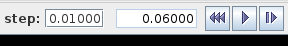
2.4 Simulating a model
Once a model is loaded, simulation of the model can be started, paused, single-stepped, or reset using the play controls (Figure 1) located at the upper right of the ArtiSynth window frame.
3 The Viewer
The viewer provides interactive graphical rendering of the ArtiSynth model and permits selection of its components. A viewer is integrated into the ArtiSynth main frame; additional viewers can be created if necessary.
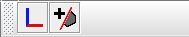
3.1 Viewer Toolbar
Each viewer is provided with a toolbar (Figure 2) equipped with icons for controlling the viewpoint (Section 3.2) and clipping planes (Section 3.6). The toolbar for the main viewer appears vertically at the lower left of the main frame, while toolbars for additional viewers appear horizontally at the top. Each is an instance of Java’s JToolBar, and so can be moved and docked accordingly.
3.2 Viewpoint Control
The viewpoint can be controlled interactively using mouse drag actions. On systems with a three-button mouse, this is generally done using the middle mouse button (MMB), in conjunction with the SHIFT and CTRL modifier keys:
- MMB
-
Rotates the viewpoint about the viewer center point.
- MMB + SHIFT
-
Translates the viewpoint in a plane perpendicular to the line of sight.
- MMB + CTRL or mouse WHEEL
-
Zooms in or out by moving the viewpoint along the line of sight. Rotate wheel forward or drag mouse forward with CTRL and middle mouse button pressed to zoom in. Rotate or drag backwards to zoom out.
On systems that have a one or two button mouse, the mouse bindings are adjusted by default so that the ALT modifier key emulates the middle mouse button. Mouse bindings are discussed in detail in Section 3.8.
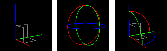
Predetermined viewpoints can also be selected using the align axis button located on the viewer control bar. Clicking on this button produces an icon menu showing six different axis-aligned views. Each view is indicated by the two axes perpendicular to the line of sight, with the X, Y, and Z axes illustrated by red, green, and blue lines respectively:
 |
Front: | Z axis up, X axis to the right. |
 |
Back: | Z axis up, X axis to the left. |
 |
Top: | Y axis up, X axis to the right. |
 |
Bottom: | Y axis down, X axis to the right. |
 |
Left: | Z axis up, y axis to the right. |
 |
Right: | Z axis up, y axis to the left. |
The align axis button itself displays the most recently selected axis-aligned view. Hitting the ‘v’ key from within the viewer (Section 3.9) will realign the viewpoint to this view.
3.3 Adding Additional Viewers
Additional viewers can be created by selecting View > New viewer from the main menu. Each viewer provides independent viewing and selection control for the current model.
We are considering adding an option whereby the main viewer can be split into four independent viewing panels, providing orthogonal projections of the front, side, and top, along with a general perspective projection. This arrangement is common in CAD and geometric modeling applications.
3.4 Orthographic vs. Perspective Projection
The user can toggle between orthographic and perspective projection by selecting View > Orthographic view or View > Perspective view from the main menu. Toggling can also be achieved using the ‘o’ key shortcut (Section 3.9) within the viewer.
3.5 Viewer Grid
Hitting the ‘g’ key within the viewer enables or disables a grid (Figure 3). Grid cells are square and appear in two resolutions, with major cells subdivided into a number of minor cells. Major cells are typically rendered more brightly than minor cells. By default, the grid computes the cell sizes automatically based on the current viewer zoom-level. However, it is possible to set an explicit grid resolution (see 3.5.1).
The grid is located in the plane perpendicular to the line of sight of the most recently selected axis-aligned view. To change the grid plane, select a new axis aligned viewpoint (Section 3.2).
3.5.1 Grid units
When the grid is enabled, a box labeled Grid: appears in the toolbar on top of the main ArtiSynth frame which gives the current resolution of the grid, displayed as S/N, where S is the size of each major grid cell and N is the number of subdivisions per cell. If there are no subdivisions, then the /N is omitted. For example, in Figure 3, this appears as Grid: 1/10, which means that the major grid cells have a size of 1.0 and are each divided into 10 subdivisions. The numeric value of the ratio S/N gives the minor cell size.
By default, the grid automatically resizes itself to the current viewer zoom level, choosing well-rounded numbers for the grid cell size. Auto-sizing can be enabled or disabled by right clicking on the Grid: label and choosing Turn auto-sizing on or Turn auto-sizing off, as appropriate. The user can also specify an explicit value for the grid resolution by entering the desired S/N value (or just an S value) into the Grid: box. Specifying an explicit value will disable auto-sizing, unless S is specified as 0 or the special value * is entered, both of which will renable auto-sizing.
3.5.2 Axis Labeling
Hitting the ‘l’ key within the viewer enables or disables labeling of the major divisions along the horizontal and vertical axis (Figure 4). The division lines along which these labels appear are automatically adjusted so as to ensure proper label visibility, and do not necessarily correspond to the x, y, or z axes.
It is possible to control various properities associated with axis labeling, such as which axes are labeled, and the label size and color. See the next section on Grid properties.
3.5.3 Grid properties
The grid has a number of properties that can be set by right clicking in the viewer and choosing Set viewer grid properties (or by right clicking on the Grid: label and choosing Set properties). This will bring up a property dialog, such as that shown in Figure 5.
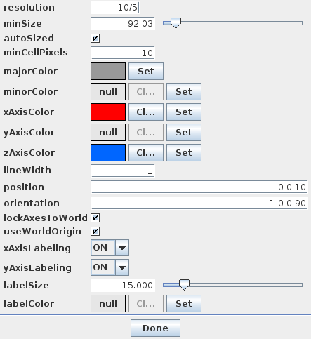
Properties that can be set include:
- resolution
-
Grid resolution, as described above.
- autoSized
-
If true, causes the grid resolution to be recomputed as the user adjusts the view position, orientation, and zoom.
- minCellPixels
-
Minimum number of pixels that should appear in a minor cell division when autosizing.
- majorColor
-
Color to use for the major axis lines.
- minorColor
-
Color to use for the minor axis lines.
- xAxisColor
-
Color to use for the grid line that corresponds to the world y axis, or the horizontal axis if lockAxesToWorld is false.
- yAxisColor
-
Color to use for the grid line that corresponds to the world y axis, or the vertical axis if lockAxesToWorld is false.
- zAxisColor
-
Color to use for the grid line that corresponds to the world z axis.
- lineWidth
-
Width of the grid lines, in pixels.
- position
-
Translation position of the grid, in world coordinates.
- orientation
-
Orientation of the grid, in world coordinates.
- lockAxesToWorld
-
If true, forces the grid to stay aligned with the orientation and position of the world axes. In particular, the horizontal and vertical axes will always be parallel to one of the x, y, or z world axes, the grid center will be a multiple of major cell sizes from the origin, and axis labels will be set relative to the world origin.
- useWorldOrigin
-
If true, causes the principal horizontal and vertical axes to be aligned with the world origin. Otherwise, the axes will be aligned with the grid center. This property can only be true if lockAxesToWorld is also true.
- xAxisLabeling
-
Enables labeling of the x axis.
- yAxisLabeling
-
Enables labeling of the y axis.
- labelSize
-
’em’ size of the label text, in pixels.
- labelColor
-
If set, specifies the color used to draw the label text. Otherwise, the major axis color is used.
3.6 Clipping Planes
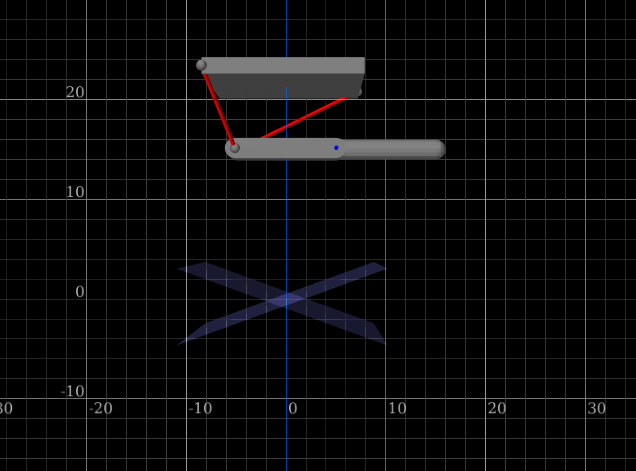
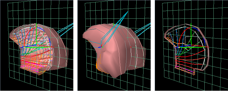
The user can add clipping planes to the viewer. These are useful for restricting what is rendered and allowing a better view of interior structures, as shown in (Figure 6).
3.6.1 Adding and removing
To add a clipping plane, left click on the add clip plane
button  located on the
viewer toolbar. This will create a clipping plane located in the plane
perpendicular to the current line of sight.
located on the
viewer toolbar. This will create a clipping plane located in the plane
perpendicular to the current line of sight.
It will also add to the viewer toolbar a clip plane icon
 for controlling the
clipping plane. Right clicking on this icon will bring up an option
menu.
for controlling the
clipping plane. Right clicking on this icon will bring up an option
menu.
To delete a clipping plane, right click on its icon and select Delete.
3.6.2 Moving
A clip plane is associated with a coordinate system and can be moved and/or rotated by dragging on the trans-rotate transformer located at its coordinate system origin. The clip region is the half space lying in the direction of the +z axis.
The transformer itself can be made invisible/visible by right clicking on the clip plane icon and selecting Hide transformer or Show transformer.
3.6.3 Offsets
The clipping region is the half space lying in the direction of the +z axis of the plane’s local coordinate system. By default, clipping is actually offset by a small distance along the +z axis, so that small objects (such as points) lying in the x-y plane remain visible. The amount of this offset is controlled by the plane’s offset property, which is set to a nominal default value. To control this property directly, right click on the clip plane icon and select Set properties. This will bring up a panel which allows the offset to be adjusted.
3.6.4 Enabling/disabling
Left clicking on the clip plane icon will enable/disable
clipping. Disabling clipping allows the plane to be used as a regular
movable grid. When clipping is disabled, the icon
will change to the form
 .
.
3.6.5 Slicing mode
Clipping planes can be placed in a slicing mode, whereby half-spaces in both the positive and negative z directions are clipped. The result is a small slice about the local x-y plane (Figure 6, right). The width of this slice is controlled by the plane’s offset property, as described above.
To enable or disable slicing, right click on the clip plane icon and select Enable slicing or Disable slicing.
3.6.6 Other features
- Properties
-
Various properties associated with the plane, such as its color, line width, cell resolution, etc., can be set explicitly by the user. To do this, right click on the icon, select Set properties, and edit the resulting property panel. Most properties are the same as those described for the main viewer grid in 3.5.3.
- Grid visibility
-
To make the grid invisible/visible, right click on the icon and select Hide grid or Show grid.
- Alignment with world axes
-
The clip plane can be aligned so that it’s normal lies along the positive or negative direction of either the x, y, or z world axes. Right click on the icon and select the appropriate option. Clipping is performed so that the half-space lying in the direction of the normal is clipped.
- Alignment with current line of sight
-
To align the clipping plane so that it is perpendicular to the current line of sight, right click on the icon and select Reset.
3.7 Indicating 3D Positions with the Mouse
It is possible to use a viewer in combination with a mouse to specify the position of a 3D point in space. This is commonly employed in the editing operations described in Section 13.
To specify a point, the user left-clicks the mouse in the viewer, at the screen postion located over the point’s desired position. The 3D position is then determined by intersecting the ray indicated by the mouse clock with some appropriate surface or plane. Typically, a plane perpendicular to the viewing direction and passing through the model’s center is used. Alternatively, some interactions provide a constrain to plane option, which causes the ray to be intersected witha viewer clipping plane (Section 3.6), providing more precise control over the point’s position. This requires that the viewer presently contain at least one clipping plane. If more than one clipping plane is present, the first one is used.
In other applications, the desired point may be known to lie on a 3D surface, in which case the position is determined by intersecting the ray with a 3D surface mesh.
3.8 Alternate Mouse Bindings
The ArtiSynth GUI was designed for a three-button mouse, in which the left button is used for selection, the middle button controls the viewpoint, and the right button is used to activate the context menu. These are used in conjunction with the modifier keys SHIFT and CTRL to effect different actions.
For systems that do not have a three button mouse, ArtiSynth by default detects the number of mouse buttons and adjusts the mouse bindings so that the ALT key emulates the middle button and the META key emulates the right button.
The META key is usually associated with either the COMMAND key (Mac) or the WINDOWS key.
Mouse bindings can also be explicitly set by the user, by openning the mouse preferences dialog Settings > Mouse Preferences and then choosing the desired binding. This dialog also displays the button and modifier combinations associated with different actions. Alternate bindings may also be requested from the command line using the -mousePrefs <bindings> option. Currently, there are three default and two legacy bindings:
- ThreeButton
-
Default bindings for a three-button mouse.
- TwoButton
-
Default bindings for a two-button mouse. The middle mouse button is emulated with the ALT key.
- OneButton
-
Default bindings for a one-button mouse. The middle and right mouse buttons is emulated with the ALT and META keys.
- Laptop
-
Legacy bindings for a two-button mouse.
- Mac
-
Legacy bindings for a Mac type one-button mouse.
Tables showing the button and modifier combinations that effect different actions with each of these binding are given below, with LMB, MMB, and RMB denoting the left, right and middle mouse buttons. Actions marked with an asterix (*) are drag actions which can have their modifier keys invoked or removed during a drag operation.
| Action | ThreeButton | TwoButton | OneButton |
|---|---|---|---|
| Viewpoint control (Section 3.2) | |||
| Rotate view | MMB | MMB+ALT | MMB+ALT |
| Translate view | MMB+SHIFT | MMB+ALT+SHIFT | MMB+ALT+SHIFT |
| Zoom view | MMB+CTRL | MMB+ALT+CTRL | MMB+ALT+CTRL |
| Component selection (Section 4.3) | |||
| Single selection | LMB | LMB | LMB |
| Multiple selection | LMB+CTRL | LMB+CTRL | LMB+CTRL |
| Elliptic selection | LMB | LMB | LMB |
Elliptic deselection
|
LMB+SHIFT | LMB+SHIFT | LMB+SHIFT |
| Resize paint ellipse | LMB+SHIFT+CTRL | LMB+SHIFT+CTRL | LMB+SHIFT+CTRL |
| Context menu | RMB | RMB | LMB+META |
| Manipulator control (Section 5.2) | |||
| Move | LMB | LMB | LMB |
| Constrained move
|
LMB+SHIFT | LMB+SHIFT | LMB+SHIFT |
| Reposition
|
LMB+CTRL | LMB+CTRL | LMB+CTRL |
while the legacy bindings are:
| Action | Laptop | Mac |
| Viewpoint control (Section 3.2) | ||
| Rotate view | LMB | LMB+ALT |
| Translate view | LMB+SHIFT | LMB+ALT+SHIFT |
| Zoom view | LMB+ALT | LMB+ALT+META |
| Component selection (Section 4.3) | ||
| Single selection | LMB+CTRL | LMB |
| Multiple selection | LMB+SHIFT+CTRL | LMB+META |
| Elliptic selection | LMB+CTRL | LMB |
| Elliptic deselection
|
LMB+SHIFT+CTRL | LMB+SHIFT |
| Resize paint ellipse | LMB+SHIFT+CTRL | LMB+SHIFT+CTRL |
| Context menu | RMB | LMB+CTRL |
| Manipulator control (Section 5.2) | ||
| Move | LMB | LMB |
| Constrained move
|
LMB+SHIFT | LMB+SHIFT |
| Reposition
|
LMB+ALT | LMB+ALT |
3.9 Keyboard Shortcuts
When the viewer has the keyboard focus, the following key shortcuts are available:
| Key | Operation |
|---|---|
| q | quit ArtiSynth |
| t | toggle time line visiblity |
| z | undo last command |
| Play controls (Section 2.4): | |
| p or SPC | play/pause |
| s | single step |
| r | reset |
| Viewer controls: | |
| v | reset view (Section 3.2) |
| o | toggle orthographic/perspective view (Section 3.4) |
| a | toggle visibility of axes showing world coordinates |
| g | toggle viewer grid (Section 3.5) |
| l | toggle viewer grid labels |
| Selection and manipulation (Sections 4.3 and 5.2): | |
| ESC | select parent of last selection |
| c | clear selection |
| d | reset elliptic cursor size to default |
| w | set current manipulator frame to world coordinates |
| b | set current manipulator frame to body/local coordinates |
4 Component Navigation and Selection
An ArtiSynth model is composed of a hierarchical arrangement of model components (each of which implements the interface ModelComponent), some of which may themselves be models. The graphical interface allows users to navigate this hierarchy and select individual components. Selected components can then be edited, or have specific properties modified or attached to probes or control panels.
4.1 The Component Hierarchy
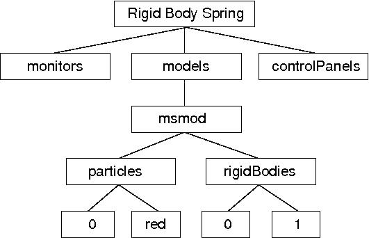
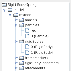
An example component hierarchy is shown in Figure 7. At the top is a root model (class RootModel), in this case named Rigid Body Spring. The root model in turn contains a list of models, one of which is a mechanical model named msmod, which here contains particles and rigid bodies.
It is important to node that in the component hierarchy, any collection of components is itself a component (usually an instance of ComponentList). This provides automatic ``grouping'' of components of like type, but does introduce additional levels into the hierarchy. Hence the particle red is a child not of msmod, but rather the component list particles.
4.1.1 Component names and numbers
Model components may be assigned a string name; at the time of this writing names may not begin with a digit, have zero length, contain the characters ‘.’ or ‘/’, or equal the reserved word this. Components which do not have an assigned name are called nameless.
All components have a number, even if they do not have a name. The number is assigned automatically when the component is added to the parent, and is guaranteed to be persistent until the component is removed from the parent.
4.1.2 Component path names
The names and/or numbers of a component’s ancestors can be used to form a component path name. This path has a construction completely analogous to Unix file path names, with the ‘/’ character acting as a separator. Absolute paths start with ‘/’ and begin with the root model. Relative paths omit the leading ‘/’ and can begin lower down in the hierarchy. The absolute path name of the red particle in Figure 7 would be
/Rigid Body Spring/models/msmod/particles/red
For nameless components in the path, their numbers can be used instead:
/Rigid Body Spring/models/msmod/rigidBodies/1
Numbers can be used even for components that have names. Hence a path name consisting only of numbers, as in
/0/0/0/3/1
is legal, although it most likely to appear only in machine-generated output.
4.2 Navigation Panel Selection
A navigation panel in the main ArtiSynth frame allows direct
navigation of the component hierarchy. The panel can be
open or closed by clicking on the menu bar icon
 .
.
Left clicking on any component in the navigation panel selects that component. Clicking while pressing the CTRL key (or the CMD key on some platforms, such as Mac) allows selection of multiple components. Clicking while pressing the SHIFT key allows selection of a range of components.
4.2.1 Large numbers of nameless components
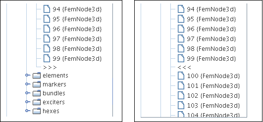
In some cases, such as finite element models, the number of child components can be very large (on the order of thousands). In order to keep the navigation panel size manageable, the number of nameless children displayed is limited to a set number (currently 100). If the number of nameless children exceeds this number, the display will be augmented with an expand icon >>>. Clicking on this will expand the display to include all nameless components, and the expand icon will be replaced by a contract icon <<<. Clicking on the contract icon will cause the extra nameless components to be hidden again. This is illustrated in Figure 9.
4.3 Viewer Selection
Components that are rendered in the viewer can generally be selected by variety of methods (the exception is for a few renderable components that do not support selection). These methods include click, box, and elliptic selection. The top two icons in the selection toolbar at the left of the ArtiSynth frame control the current selection method. In addition, hitting the ‘c’ key from within the viewer (Section 3.9) clears the current selection.
4.3.1 Click and box selection
Click and box selection are enabled by the arrow icon at the top of the selection toolbar:
Click selection involves left clicking on a component, causing it to be selected. Selection of multiple components is enabled by left clicking with a modifier key, which is usually CTRL but may be different for some legacy mouse bindings (Section 3.8).
Click selection selects only those components which are actually visible to the viewer; components which are hidden cannot be selected this way.
Box selection is effected by left-clicking and dragging in the viewer, causing the selection of all components rendered within the resulting drag box. Because this often results in the selection of more components than desired, it may be useful to employ a selection filter (Section 4.3.3). Any components within the drag box which are already selected will be deselected.
Box selection acts on all (filtered) components within the view frustum defined by the drag box, including those which are hidden from view.
4.3.2 Elliptic selection
Elliptic selection is enabled by the elliptic icon near the top of the selection toolbar:
This causes an additional elliptic cursor (which defaults to a circle) to be drawn around the mouse cursor. Selection is effected by dragging, and causes all visible objects within the ellipse to be selected. The selection process is cumulative, with subsequent drags selecting additional components. As with all selection operations, a filter can be set to restrict the components that are selected (Section 4.3.3). Generally, the drag select operation requires no modifier keys, although it may with some legacy mouse bindings (Section 3.8).
It is also possible to deselect components in the same way, by using the SHIFT modifier key to cause drag operations to cumulatively deselect components.
Elliptic selection selects only those components which are actually visible to the viewer; components which are hidden cannot be selected this way.
The elliptic cursor used for selection can be resized, either interactively, or by setting the ellipticCursorSize property of the viewer. To interactively change the cursor, initiate a drag operation with the CTRL and SHIFT modifiers. To set the ellipticCursorSize, invoke the context menu (usually right click) in the viewer when nothing is selected, and choose Set viewer properties. Finally, the ‘d’ key shortcut within the viewer will cause the cursor to be reset to its default size.
4.3.3 Selection filtering
It is possible to limit viewer selection to components of a specific type. This can be done using the selection filter widget at the bottom left of the main ArtiSynth frame Figure 10.
To enable filtering, type into the widget text box the class name of the component type you wish to restrict filtering to. It is generally only necessary to enter the leaf name of the class (e.g., Particle or AxialSpring), and the system will then find the full class name by searching the ArtiSynth class path.
Once filtering is enabled, only components which are instances (including subclasses) of the specified type will be selectable.
Previously selected filters can be recalled using a history list accessible using the leftmost arrow button on the selection widget.
To remove selection filtering, enter the special filter *, either by typing this in the text box, or using the history list.
4.4 Selection Display
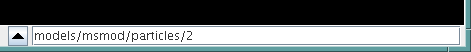
The selection display Figure 11 at the bottom of the main ArtiSynth frame shows the full path name of the last component added to the selection list. This is useful for identifying components in detail.
If no components are selected, then the selection display is blank.
The selection display is useful for disambiguating situations where it is not clear what component we have actually selected in the viewer. For example, FEM models keep their surface mesh contained within a descendant component. Selecting the surface mesh will cause this container component to be selected and highlighted, making it appear as though the FEM model itself is selected rather than the container. Checking the selection display makes it clear what component has actually been selected. If desired, one can easily navigate to one of the ancestor components using parent selection, as described in the next section.
4.5 Selecting Parent and Ancestor Components
Sometimes, when you select a component, you actually want to select one of it’s ancestor components.
There are several ways to do this:
-
1.
Hit the escape (ESC) key within the viewer window. This will select the parent of the currently selected component. Hitting escape repeatedly is a fast way to proceed up the component hierarchy.
-
2.
Click on the ``up'' arrow located at the left of the selection display (Figure 11). This will also select the parent of the currently selected component.
Parent selection is particularly useful in the commonly occurring situation where a composite component is not rendered and therefore not selectable in the viewer. For instance, suppose we wish to select a FEM model. One can select any renderable descendent of the model, such as a node, element, or its surface mesh (if displayed), and then use repeated parent selection until the model itself is selected.
4.6 Highlighting Selected Components
Selected components are rendered in the viewer using a special selection color (yellow at the time of this writing). It is important to note that descendents of a selected component are not presently rendered in any special way. For instance, if an FEM is selected, it’s nodes and elements will be rendered normally.
While this has the potential to be confusing, we have not yet found this to be problematic, as the navigation panel and selection display provide alternative indicators as to what is currently selected.
5 Geometric Manipulation
It is possible to modify component locations, orientations, and geometry using the transformation tools located at the left side of the main ArtiSynth frame. Tools will only transform those transformable components which implement the TransformableGeometry interface. The behavior may also vary depending on whether or not simulation is in progress.
5.1 Dragger Fixtures
The transformation tools employ the dragger fixtures shown in Figure 12, which allow 3D geometrical transformations to be performed within the viewer.
- Translator
-
Effects a translation. The x, y, and z axes are indicated by red, green, and blue lines. Dragging any line causes a one-dimensional motion along the associated axis. Dragging one of the boxes causes a two-dimensional motion in the associated plane.
- Rotator
-
Effectors a rotation. Rotation about the x, y, and z axes is indicated by red, green, and blue circles. Selecting and dragging along one of these circles produces a rotation about the corresponding axis.
- TransRotator
-
Combines the translator and rotator into a single tool. One difference is that the axes of the transRotator move with any rotation, and so operations are done with respect to the transRotator coordinate frame at the beginning of the drag.
Under the default mouse bindings, the basic drag operations involving these fixtures are invoked using the left mouse button with no modifier keys. Additional modifier keys allow constrained manipulation or repositioning of the fixture, as described below.
5.2 Manipulation Tools
A number of manipulation tools use the dragger fixtures described above to translate, rotate, and scale components. Once a tool is activated, then selecting one or more transformable components will cause the corresponding dragger fixture to appear in the viewer at the components’ location. If a single component is selected and that component is associated with a coordinate frame (by implementing the HasCoordinateFrame interface), then the dragger’s initial position and orientation are aligned with this coordinate frame. Otherwise, the dragger is initially placed at the center of the components’ bounding box and its orientation is aligned to world coordinates.
To request that a dragger’s initial orientation is always aligned with world coordinates, choose Init draggers in world coordinates in the ArtiSynth Settings menu. To restore the default behaviour, choose Init draggers in local coordinates.
.
Selection:
Click and box selection mode. Turns off manipulation.
.
Elliptic Selection:
Elliptic selection mode. Turns off manipulation.
. Translation:
Translates selected components using the translator dragger.
. Rotation:
Rotates selected components using the rotator dragger.
. TransRotation:
Translates and rotates selected components
using the transRotate dragger. The transformation reference frame
moves with the tool.
. Constrained translation:
Translates selected components using the translate dragger while ensuring that
they are constrained to remain on a surface mesh. Only components with
an associated surface mesh (such as FrameMarkers attached to a
RigidBody) can be manipulated this way.
. Scaling:
Scales selected components using the transrotator
fixture. Instead of translating, translational drag operations
scale the component along the x, y, or z axes, or in the
x-y, y-z, or z-x planes. Rotational operations, if
used in conjunction with an appropriate modifier key,
can be used to change the orientation of the scaling axes,
as described in 5.2.2.
. Pulling:
Pulls on points and rigid bodies using a spring-like force
when simulation is running. See Section 5.3.
5.2.1 Constrained manipulation
Under the default mouse bindings, pressing the SHIFT modifier key causes drag operations to be constrained to discrete step sizes. Rotation operations are constrained to intervals of five degrees, while translation operations are constrained to either the grid spacing (if a grid is selected, see 3.5), or to a suitable well-rounded number depending on the viewer’s zoom level.
5.2.2 Manipulator repositioning
Under the default mouse bindings, pressing the CTRL modifier key causes the dragger fixture to move independently of the selected objects. This allows its position and orientation relative to the selected objects to be changed. This is particularly useful for changing the orientation of the scaling directions in the scaling tool.
5.2.3 Changing the manipulator base frame
By default, a manipulator is assigned a local coordinate frame for the object(s) that it is positioning, based on either the object’s own body frame (if it has one), or the objects’ bounding box. This frame will then move with the manipulator, and may also move relative to the object(s) if the manipulator is repositioned (Section 5.2.2).
Sometimes, it may be desirable to explicitly reset the manipulator’s frame. This may be done using the following shortcut keys in the viewer:
- w
-
Set the manipulator frame to the world coordinate system, allowing subsequent manipulations to be performed in world coordinates;
- b
-
Reset the manipulator frame to the orginal local frame for the object(s), based on either the object’s body frame or the objects’ bounding box.
5.3 Pull Manipulation
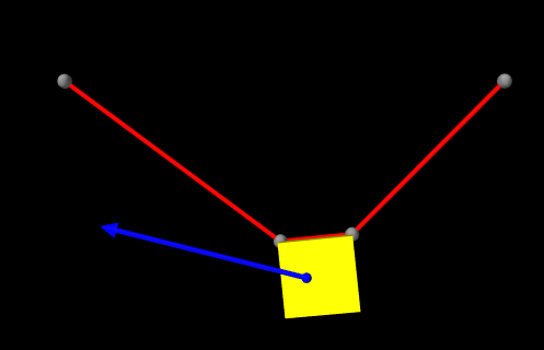
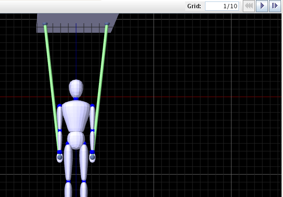
A "pull" manipulator allows a user to interactively apply a spring-like force to either a point or rigid body by clicking on it and then dragging (Figure 13). To enable pull manipulation, select the pulling tool (Section 5.2).
Pull manipulation is only effective when simulation is running. It works by adding a special PullController to the current root model. When attached to the root model, the controller attempts to estimate an appropriate spring stiffness based on the overall mass and dimensions of the first underlying MechModel.
If necessary, the stiffness setting can also be adjusted manually by selecting PullController > properties in the Settings menu. Render properties for the pull controller can be set from this menu also.
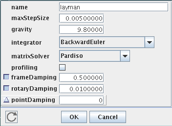
6 Editing Properties
Most ArtiSynth model components have properties which can be changed onscreen through the graphical interface. Properties include a diverse set of attributes ranging from stiffness and damping for AxialSprings, position and velocity for particles and rigid bodies, or whether or not a component is dynamic.
The underlying software architecture of the property interface is described in the maspack documentation.
6.1 Property Panels
To edit properties for a set of components, select the components in question, then right click in either the viewer or the navigation panel, and select Edit properties. This will create a property panel for all properties which are common to the selected components. All typical property panel is shown in Figure 14.
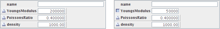
Property panels are initialized with the current values of the selected components, providing a view of the current property state. A blank property value will be displayed when more than one component is selected and the corresponding property value differs across components.
Some properties are read only. In this case, the corresponding widget in the property panel will display the value but will be disabled.
Property panels are non-modal and persistent. They can be deleted by closing them or clicking the OK button. Clicking the Cancel button will cause the properties to be reset to their values at the time to panel was created.
Normally, a property panel will refresh its widget values whenever the
model view is rerendered. In particular, this will happen repeatedly
while simulation is running. To disable the automatic refresh, click
the live updating button
 at the lower
left of the panel.
at the lower
left of the panel.
6.1.1 Inheritable properties
Some properties are inheritable. The value of an inheritable property can be explicitly set or it can be inherited. If inherited, then it inherits its value from ancestor components further up the hierarchy. More specifically, if a property’s value is inherited, then the value is obtained from the nearest ancestor in which the same property exists and is explicitly set. If no such ancestor exists, then the property is set to a default value.
The inherited/explicit status of an inheritable property is controlled by an additional button placed at the left of the property widget (Figure 15). Clicking this button toggles the inherited/explicit status. If set to inherited, then the property’s value is determined from the hierarchy and the updated value is placed in the widget. Setting the value in the widget itself will cause the inheritable status to be set to explicit, and the value of inherited instances of the same property in descendent nodes will be updated accordingly.
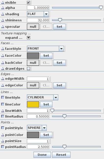
6.2 Render Properties
Render properties are associated with any component that is renderable. They are defined in the class RenderProps. Because of their complexity, they are adjusted through a separate panel from the standard property panel.
To adjust the property panel for a set of components, select the components in question, using either the viewer window or navigation panel, and then right click in either the viewer or the navigation panel. Several options may appear in the context menu:
- Edit render props
-
- Clear render props
-
This will actually remove the render properties from the selected components (i.e., their render properties will be set to null). Nominally, this means that the components will not be rendered, unless their parents take responsibility for rendering children without render properties. The latter behaviour is common for lists of particles, springs, finite elements, etc., in order to avoid the need for defining render properties in a large number of objects.
- Set visible
-
This option will appear if any of the selected objects are invisible. Selecting it will set the render properties so that all components are visible.
- Set invisible
-
This option will appear if any of the selected objects are visible. Selecting it will set the render properties so that all components are invisible.
6.2.1 Render property settings
There are a large number of render property settings. Loosely speaking, they are divided into generic settings, along with those related to faces, lines, and points. How these are used depends on what is being rendered. Mesh rendering typically uses the face settings, along with the line settings to render edges if the drawEdges property is set true. Line settings are also used for rendering axial springs and the edges of FEM elements. Point settings are used for rendering any subclass of Point, including Particle and FemNode.
Not all render properties may appear in a render panel; usually, only those properties relevant to the selected components will be presented.
- Generic properties:
-
- visible:
-
Whether or not the component is visible.
- alpha:
-
The transparency for polygonal faces (range 0 to 1. Default is 1, for opaque).
- shading:
-
How polygons are shaded (FLAT, SMOOTH, METAL and NONE). For viewer implementations there may be no difference between SMOOTH and METAL.
- shininess:
-
Shininess parameter for polygons (range 0 to 128). Default is 32.
- specular:
-
If not null, specifies the specular reflectance color.
- Face related properties:
-
- faceStyle:
-
Which polygonal faces are drawn (FRONT, BACK, FRONT_AND_BACK, NONE).
- faceColor:
-
Color used for drawing faces.
- backColor:
-
Color used for drawing backs of faces. If null, faceColor is used.
- drawEdges:
-
If true, face edgesof the polygons are drawn explicitly.
- Texture mapping properties:
-
- colorMap:
-
If not null, specifies the image source file and properties for color mapping.
- normalMap:
-
If not null, specifies the image source file and properties for normal mapping.
- bumpMap:
-
If not null, specifies the image source file and properties for bump mapping.
- Edge related properties:
-
- edgeColor:
-
The color for edges.
- edgeWidth:
-
Edge width in pixels.
- Line related properties:
-
- lineStyle:
-
How lines are drawn (CYLINDER, LINE, or SPINDLE).
- lineColor:
-
The color for lines.
- lineWidth:
-
Line width in pixels when LINE style is selected.
- lineRadius:
-
Cylinder radius when CYLINDER or SPINDLE style is selected.
- Point related properties:
-
- pointStyle:
-
How points are drawn (SPHERE or POINT).
- pointColor:
-
The color for points.
- pointSize:
-
Point size in pixels when POINT style is selected.
- pointRadius:
-
Sphere radius used when SPHERE style is selected.
A typical panel for editing render properties is shown in Figure 16. Texture mapping properties, if present, are normally hidden by default and can be exposed by clicking on the expand... button.
7 The Timeline
The timeline is a panel that allows the user to graphically arrange temporal sequences of probes and waypoints to control the simulation. If not initially visible, its visibility can be toggled by hitting the ‘t’ key from within the viewer (Section 3.9).
7.1 Basic Structure
The basic structure of the timeline is shown in Figure 17.
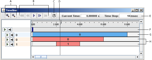
The toolbar at the top contains the following widgets:
- Zoom controls
-
Shrinks or expands the timescale.
- Play controls
-
Starts, pauses, or resets the simulation.
- Save button
-
Saves the data for all probes with attached files.
- Time box
-
Shows the current simulation time.
- Time step box
-
Shows the length of time associated with a ``single step'' command.
7.1.1 Play controls
The play controls are in turn comprised of the following buttons:
 |
Reset: | Resets the simulation to the beginning at time 0. |
 |
Rewind: | Moves the simulation time backward to the nearest previous waypoint (see Section 7.2). |
 |
Play: | Starts the simulation. |
 |
Pause: | Takes the place of the play button and pauses the simulation. |
 |
Single step: | Advances the simulation by a single step, specified in the time step box. |
 |
Fast forward: | Moves the simulation time forward to the nearest following waypoint (see Section 7.2). |
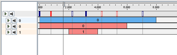
7.1.2 Tracks
The timeline proper is divided into a number of tracks. At the top is the waypoint track, which is used to arrange waypoints and breakpoints. Below that are a variable number of input and output tracks, which are used respectively for arranging input probes and output probes.
7.2 Waypoints and Breakpoints
7.2.1 Waypoints
Waypoints save the model state when the simulation passes through them, allowing the timeline to be reset to that point (using the fast forward/backward buttons) at a later time without having to recompute the simulation from the beginning.
Waypoints are arranged along the waypoint track at the top of the timeline and are indicated by a small rectangular blue box (Figure 18). A solid box indicates a waypoint that contains a valid state and thus can be advanced to using the fast forward/backward buttons.
To add a waypoint, context click on the model track. A popup menu will show a number of options, including Add Waypoint Here, which adds a waypoint at the current location of the time cursor, and Add Waypoint(s), which will bring up a dialog prompting for a specific time to add a Waypoint. The "Add Waypoint" dialog also contains a repeat field, which will cause additional waypoints to be added with a spacing indicated by the time value, and an option to create breakpoints instead of waypoints.
Once created, waypoints can be moved by dragging them. They can also be deleted by context clicking on them and selecting the Delete Waypoint option.
To delete all the waypoints, context click on the model track and select Delete Waypoints.
7.2.2 Breakpoints
Breakpoints are waypoints that also cause the simulation to stop. They are displayed in red instead of blue.
Breakpoints can be added in the same way as waypoints, i.e., by right clicking on the model track and selecting Add Breakpoint Here or Add Waypoint(s).
Waypoints can be converted into breakpoints (and vice versa) through the context menu.
7.3 Tracks and Probes
Probes are arranged on tracks located beneath the waypoint track. Input probes must be placed on input tracks and output probes must be placed on output tracks. Furthermore, probes on the same track are not allowed to overlap.
Note:
In the future, additional restrictions may be placed on what type of probe can be placed on what track.
Probes can be moved horizontally to different times as well as vertically onto different tracks. They can also be stretched by dragging the edges of the probe and cropped by holding the control key while stretching.
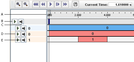
On the left side of the timeline is the track panel, which contains a number of track control widgets (Figure 19).
7.3.1 Creating, moving, and deleting tracks
New tracks may be added by context clicking in the waypoint track and selecting Add Input Track or Add Output Track.
The vertical location of a track can be moved by left clicking on it in the left panel and dragging it up or down to a new location.
A track can be deleted by context clicking on the track in the track panel and selecting Delete Track.
7.3.2 Muting tracks
A track can be muted or unmuted by clicking on its grey mute button in the track panel (Figure 19). All probes on a muted track are ignored during simulation.
All tracks can be muted, thus disabling all probes, by clicking on the mute all button in the grey panel above the tracks.
7.3.3 Expanding tracks
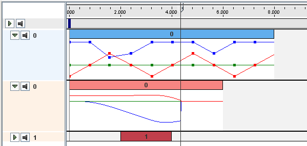
A track can be expanded or collapsed by clicking on its green expand button in the track panel (Figure 19). Expanding a track creates an additional area in which the data associated with the track’s probes may be displayed (see Figure 20). The way in which this data is displayed is probe-specific. Probes containing numeric data usually show their data graphically, as described in Section 7.4.
7.3.4 Grouping tracks
Multiple contiguous tracks can be selected by clicking on them while holding the control key. Furthermore, they can be grouped together or ungrouped by selecting the appropriate option from the context menu. Grouped tracks can be collapsed, moved simultaneously and muted together.
7.4 Numeric Probe Displays
Data associated with numeric probes is displayed as a graph within the display (Figure 20). If the probe contains a vector with more than one value, each entry in the vector is drawn using a different color (up to a limit, after which colors are recycled).
7.4.1 Setting the range
The range of the displayed data can be set by context clicking in the display and selecting Set Display Range . This pops up a dialog that lets the user either set the range explicitly, or enable automatic range computation by selecting the Auto range box.
The range of a display can also be fit to the current data set by context clicking in the display and selecting Fit Display Range.
7.4.2 Visibility control
As mentioned above, each entry in a numeric probe’s data vector is rendered in a different color (up to a limit). If the vector has a large dimension (say more than three), or if there is much overlapping of values, then the result can be difficult to visualize.
To manage this problem, numeric displays provide a legend tool that allows the user to control the color, drawing order, and visibility for each vector entry (Figure 21).
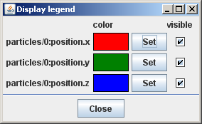
To create the legend tool, context click in the display panel and select Legend. Each row in the legend tool is associated with an entry in the data vector. The dimensions of the vectors are listed, followed by the color the entry is drawn in and a toggle controlling its visibility. Entries are rendered in bottom-to-top order, so those at the top will be most visible.
-
•
To change an entry’s color, click the Set button, which will bring up a color menu.
-
•
To make an entry visible or invisible, use the Visible toggle box.
-
•
To change the order in which an entry is drawn, click and drag the entry vertically within the panel.
7.4.3 Editing data
Data for number input probes can be changed by adding, deleting, or moving knot points in the display.
-
•
To move a knot point, left click on the knot and drag it.
-
•
To add a knot point, place the mouse at the desired location and double left-click.
-
•
To delete a knot point, right click on the knot and select Delete Data Point.
-
•
To edit a knot point, right click on the knot and select Edit Data Point.
All knot points can be made invisible/visible by context clicking in the display and selecting (In)visible Data Points.
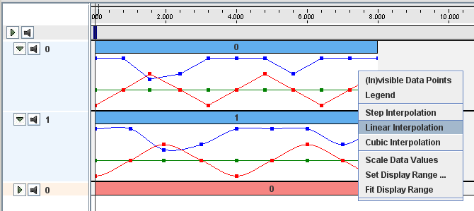
7.4.4 Interpolation control
The data between knot points in a numeric probe is interpolated. Three types of interpolation are currently available: Step, linear, and cubic (Figure 22). For input probes, the interpolation can be set by right-clicking in the display and selecting the desired one.
7.4.5 Large displays
A large display for a numeric probe can be created by context clicking on the probe icon and selecting Large Display. This will create a large numeric display in a separate panel, allowing more precise inspection of data (Figure 23).
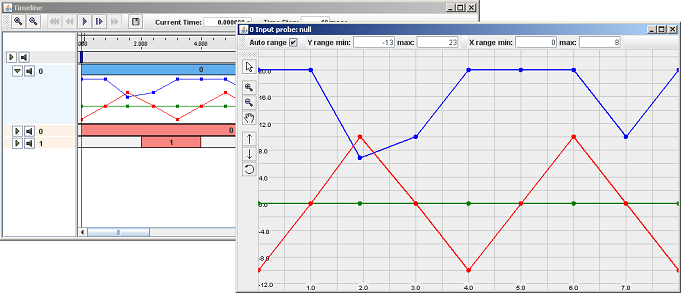
In addition to the functionality of the smaller displays, large displays have additional buttons for controlling the domain and range of the displayed data. These are located on the left side of the display and include four mode control buttons:
 |
Zoom In: | Enables a mode in which the user can zoom in on the display using a drag box. |
 |
Zoom Out: | Enables a mode in which left clicking in the display will cause it to zoom out. |
 |
Move Display: | Enables a mode in which a (zoomed-in) display can be moved using the middle mouse button. |
 |
Normal: | Clears any mode set by the previous three buttons. |
| There are also three buttons for controlling the vertical display range: | ||
 |
Increase Range: | Increases the vertical range. |
 |
Decrease Range: | Decreases the vertical range. |
 |
Fit Range: | Fits the vertical range to the current data. |
On the top of the display are the fields for manually setting the displayed range and domain. There is once again the option to enable automatic range computation through the Auto range box.
8 Visual Display
8.1 Point Tracing
Tracing can be enabled for individual points within an ArtiSynth model. This causes the point to remember the path it followed since tracing was enabled, and to render this within the viewer as strip of line segments.
Tracing is enabled by setting a point’s tracing property to true in the point’s property panel (see Section 6.1). When enabled, the point keeps a list of all the positions that it has occupied since since tracing was first enabled, and renders them as a series of line segments in the viewer.
Disabling the tracing property causes the trace data to be discarded and it’s rendering to be removed.
When tracing is enabled, the point’s render properties are expanded to include line properties. Adjusting these allow the user to control how the trace path is rendered. When tracing is disabled, these line properties are removed.
Since a point’s render properties are modified when tracing is enabled or disabled, any existing open rendering property panels for the point will no longer work correctly. Instead, the panel should be closed and reopenned.
8.1.1 Rendering only the trace(s)
It may be desirable to restrict rendering to view only the traces paths, perhaps along with a few selected model components. For instance, this might be necessary when producing graphs for a paper.
An easy way to do this is to edit the render properties for the desired points, and set the visible property to be explicitly true. Then, edit the render properties for the top-level model in the scene, and set its visible property to be explicitly false. This will make invisible all model components whose visible property is inherited. Since the traced points were explicitly set to be visible, they (and their traces) will remain visible. If the points themselves are rendered as spheres, they can be made to disappear by setting their pointStyle property to POINT, or by setting their pointRadius property to something very small.
9 Probes
Work on this section is still in progress
9.1 Saving and Loading Probes and Their Data
The system’s current probe configuration, along with the associated probe data, can be saved in the current probe directory. Within this directory, the information about probes is stored in a file called probeData.art. Actual probe data is stored in the probe’s attached file, if one is present. Attached files are named by the attachedFile property of the probe, and describe the name of the file relative to the current probe directory.
When ArtiSynth starts up, the current probe directory defaults to the directory probeData, relative to the working directory from which the application was started. In future releases, when the ability to save and restore workspaces is implemented, the current probe directory may instead by initialized from saved workspace data.
9.1.1 Saving probes
Probes can be saved using the Save probes command from the File menu. This will save the current probe configuration in the probe directory (creating this directory if necessary). It will also save data for individual probes in their attached files, if such files are present.
A probe will not always have a file associated with it. Numeric probes will always have files associated with them; if a file is not named explicitly, a file name will be generated automatically when the probe is added to the system. This generated file name will be unique with respect to all probes currently configured and all files in the current probe directory.
9.1.2 Saving probes in a different directory
To save probes in a different directory, one can use the command Save probes in from the File menu. This will prompt the user for a different directory, which will be created if necessary. The new directory will persist and the current probe directory.
9.1.3 Loading probes
Probes can be loaded form the current probe directory using the Load probes command in the File menu. The existing probe configuration will be cleared and the new configuration will be obtained from the file probeData.art, which must be present in the directory. Probes with attached files will be initialized from the data in those files.
9.1.4 Loading probes from a different directory
To load probes from a different directory, one can use the command Load probes from in the File menu. This will prompt the user for a different directory, which must currently exist and which must contain the file probeData.art. The probe configuration will then be reset from the data in this new directory, which will persist as the new current probe directory.
10 Adding and Editing Numeric Probes
Numeric input and output probes can be interactively added to a simulation. Output probes allow you to record a vector of values derived from one or more model component properties. Input probes allow you to use a vector of input data to drive one or more model component properties.
10.1 Adding Output Probes
To add a numeric output probe, go to the main menu and choose edit > add output probe. This will create a numeric output probe editor, as shown in Figure 24.

The editor contains three main panels:
-
•
A property panel at the upper left in which allows you to add or edit the properties of model components whose values will be used in computing the final output probe value. Each property is associated with a component/property widget, which allows you to first select a component and then choose one of its properties.
-
•
A formula panel at the the upper right which allows you to add or edit formulae which convert the values from the properties into numeric values for the output probe.
-
•
A probe property panel at the bottom which allows properties of the probe itself to be set.
10.1.1 Creating a simple probe
Creating an output probe that simply records the value of a single numeric property is fairly easy. Starting with the output probe editor in Figure 24:
-
1.
Select a component, either externally through the navigation panel (Section 4.2), the viewer (Section 4.3), or the selection display (Section 4.4), or by entering its path name into the component/property widget. Once a component is selected, the left-most ``up'' arrow can be used to select that component’s parent.
-
2.
Select a property for the component from the property selection box at the right of the component/property widget.
-
3.
Adjust any required properties for the probe itself (Section 10.3).
-
4.
Click Done.
10.1.2 General output probes
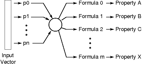
In general, output probes define a general map from the numeric values of n model component properties to a generalized output vector formed by the concatenation of m-subvectors formed by m formulae, as shown in Figure 25. In the simple case of Section 10.1.1, there is a single property, one sub-vector equal to the output vector, and a formula which is just the property value itself.
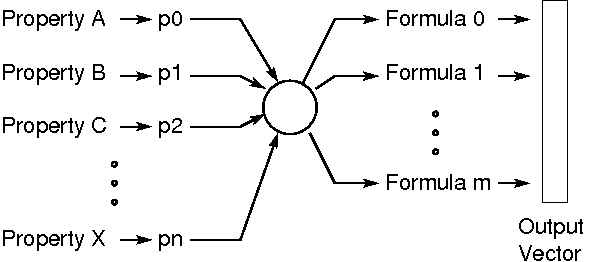
Each of the n properties has a numeric value which is
represented by a variable  and which is a vector of some dimension
(scalars being considered vectors of dimension 1). The dimension of
the depends on the property and is displayed to the right of the
property selection box on the component/property widget.
and which is a vector of some dimension
(scalars being considered vectors of dimension 1). The dimension of
the depends on the property and is displayed to the right of the
property selection box on the component/property widget.
Each of the m formulae is an arithmetic expression, implemented in
Jython, which may involve one or more of the variables . The output
from each formula is itself a vector of dimension  , which is
displayed at the right of each formula panel. The simplest formula is
just a single variable , in which case equals the dimension of
. The concatenation of all the output vectors from all the formulae
produces the output vector associated with the probe, which has a
dimension
, which is
displayed at the right of each formula panel. The simplest formula is
just a single variable , in which case equals the dimension of
. The concatenation of all the output vectors from all the formulae
produces the output vector associated with the probe, which has a
dimension  .
.
10.1.3 Using the probe editor
What the probe editor allows you to do is create the above mentioned map by selecting the properties of model components, assigning variable names to them, and creating formulae using these variables. When all the selected components form a coherent mapping, the Done button will be enabled and the probe can be completed. When one or more parts of the mapping is unspecified or incomplete, the associated widgets will be highlighted and the Done button will be disabled.
Extra properties can be added by requesting additional component/property widgets using the "+" button in the property panel. Similarly, extra formulae can be requested using the add button in the formula panel.
Properties and formulas can also be deleted; simply right click on the associated widget and choose delete.
Property variable names appear in a box at the left of the component/property widget. Variable names can be changed by editing this box. Name changes will be propagated into the formulae.
In order to streamline the probe creation process, the editor will try to guess certain desired actions. In particular, when the user chooses a property with a given component/property widget for the first time, the editor assigns a variable name to that property and creates a formula panel containing that variable. The variable name and formula panel can be changed if necessary.
Note:
The selection manager is connected to at most one component/property widget at a time. The component field for this widget is indicated with a blue border; external selections will affect only that widget. Left clicking on a component/property widget will cause it to be connected to the selection manager.
10.2 Adding Input Probes
To add a numeric input probe, go to the main menu and choose edit > add input probe. This will create a numeric input probe editor, as shown in Figure 26.
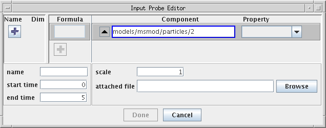
The editor contains three main panels:
-
•
An input panel at the upper left which allows you to add or edit input variables. Each of these variables represents a sub-vector of the probe’s numeric input vector.
-
•
A formula/property panel at the the upper right which allows you to add or edit numeric properties (using component/property widgets), along with formulae to determine values for these properties based on the input variables.
-
•
A probe property panel at the bottom which allows properties of the probe itself to be set.
10.2.1 Creating a simple probe
Creating an input probe that simply sets a single numeric property from the probe’s input vector is fairly easy, and is exactly analogous to creating a simple output probe (Section 10.1.1). Starting with the input probe editor in Figure 26:
-
1.
Select a component, either externally, or using the component/property widget.
-
2.
Select a property for the component from the property selection box at the right of the component/property widget.
-
3.
Adjust any required properties for the probe itself (Section 10.3).
-
4.
Click Done.
10.2.2 General input probes
In general, input probes define a general map from the probe’s
input vector (which is subdivided into n input variables
of dimension  ) to the values of m properties, where each
value is determined by an independent formula based
on the input variables (Figure 27).
In the simple case of Section 10.2.1,
there is one input variable which equals the input vector,
and it drives a single property using a formula which is
just the value of the input vector.
) to the values of m properties, where each
value is determined by an independent formula based
on the input variables (Figure 27).
In the simple case of Section 10.2.1,
there is one input variable which equals the input vector,
and it drives a single property using a formula which is
just the value of the input vector.
Each input variable is a vector of dimension (scalars being
considered vectors of dimension 1), and the sum of all the equals
the dimension of the input vector.
Each of the formulae controlling the properties is an arithmetic
expression, implemented in Jython, which may involve one or more of
the input variables . The output from each formula is itself a vector
whose dimension must match the associated numeric property.
The simplest formula is just a single variable , in which
case its dimension equals the dimension of .
10.2.3 Using the probe editor
The probe editor allows you to create the above mentioned map by creating input variables, selecting properties, and creating formulae to drive these properties. When all the selected components form a coherent mapping, the Done button will be enabled and the probe can be completed. When one or more parts of the mapping is unspecified or incomplete, the associated widgets will be highlighted and the Done button will be disabled.
Extra properties can be added by requesting additional component/property widgets using the "+" button in the formula/property panel. Similarly, extra input variables can be requested using the add button in the formula panel.
Properties and input variables can also be deleted; simply right click on the associated widget and choose delete.
Each input variable is associated with a widget containing two text fields, the left one defining the variable’s name and the right one its dimension. The name or dimension can be changed by editing these fields. Changes will be propagated into the formulae; formulae that are found to be incompatible with the changes will be cleared.
In order to streamline the probe creation process, the editor will try to guess certain desired actions. In particular, when the user chooses a property with a given component/property widget for the first time, the editor creates an input variable whose dimension matches the property, and a simple formula consisting solely of the input variable. The input variable and formula can be changed if necessary.
Note:
The selection manager is connected to at most one component/property widget at a time. The component field for this widget is indicated with a blue border; external selections will affect only that widget. Left clicking on a component property widget will cause it to be connected to the selection manager.
10.3 Setting Probe Properties
The lower part of the probe editor contains a set of fields for editing various probe properties.
- name
-
The name of the of the probe.
- start time
-
Start time for the probe, in seconds.
- stop time
-
Stop time for the probe, in seconds.
- scale
-
Specifies the scale
 for this probe, which relates the internal probe
time
for this probe, which relates the internal probe
time  to the external simulation (or timeline)
time
to the external simulation (or timeline)
time  . If
. If  is the time
at which the probe starts on the timeline, then
is the time
at which the probe starts on the timeline, then 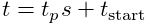 .
. - attached file
-
Names the attached file for this probe, used for storing the probe’s date. See Section 9.1.
- display range
-
Minimum and maximum range values used for the graphical display of the probe’s data. If these values are left blank, then the range is computed automatically.
- update interval
-
(Output probes only). A time interval, in seconds, specifying how often data should be output to the probe.
11 Making Movies
ArtiSynth includes a panel to aid in capturing simulations as movies. This panel is opened from the main viewer window by navigating through View > Show movie panel. When capturing a movie, pictures are saved to ARTISYNTH_HOME/tmp periodically as frameXXXXX.ext, where XXXXX represents the sequential number of the frame (with each X representing a digit), and the .ext represents the file extension (determined by the Frame File selection in the encoder panel). Because the frame files aren’t unique, recordings will overwrite frames from prior movies, and if Remove temporary files is selected, only the final products are left. When the recording is stopped, these pictures are then compressed into a movie file using either mencoder, or an internal algorithm. The resulting movie is saved to the $ARTISYNTH_HOME/tmp with the file name specified at the bottom of the recorder panel.
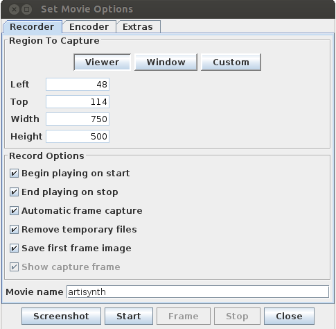
11.1 Region To Capture Options
These options define the area of the desktop recorded. The default capture area is the main viewer of ArtiSynth. Viewer sets the capture area exclusively and strictly to the main viewer, and excludes the toolbar and window. This is useful for recording model demonstrations. The Window option includes the main viewer and the toolbar and window surrounding it. The Custom option allows the user to manually set the coordinates, width and height of the region to capture through the given fields. It also displays the capture frame, which can be stretched and moved to adjust what is recorded.
When the Viewer mode is selected, there are additional options available in the Output Size section. This allows you to create higher (or lower) resolution videos, independent of the viewer’s visible resolution. The # samples specifies the size of the multi-sample buffer, which is used for anti-aliasing. This is the only mode that continues to work correctly when a screen-saver is activated.
11.2 Record Options
These options determine how the movie recorder works with ArtiSynth, and how it deals with the frame files.
- Begin playing on start
-
When the start button is clicked, the simulation will begin to run.
- End playing on stop
-
When the stop button is clicked, the simulation stops running.
- Automatic frame capature
-
Frames are automatically captured according to the movie’s frame-rate while the model is run. If this is disabled, it is up to the user to click on the Frame button to capture the next frame.
- Remove temporary files
-
When selected, the temporary frames are deleted after the movie is made.
- Save first image
-
This saves the first frame taken. These frames are useful for representing the movie in websites.
- Show capture frame
-
Opens a transparent window that reveals what will be captured. The window is stretchable and movable when the capture option is set to Custom and provides a method to graphically modify the capture area’s X coordinate, Y coordinate, width, and height.
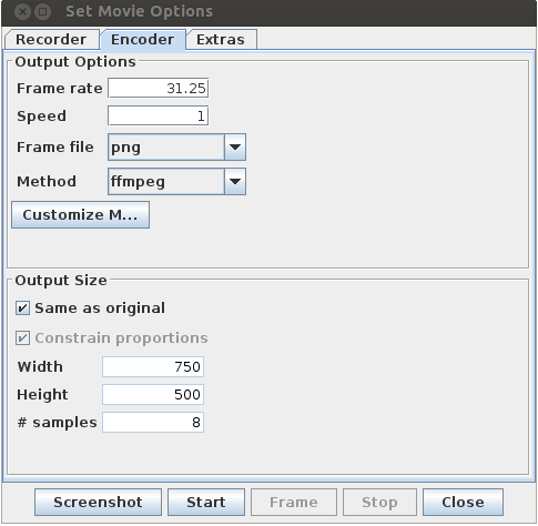
11.3 Output Options
These options control the frequency of the frames and how they are combined into a movie.
- Frame rate
-
This is the number of frames recorded per second of movie.
- Speed
-
This is the ratio of the movie’s speed to reality’s speed. While the demo is recording, the calculations may slow down the simulation, but the movie will not be affected.
Important:
If the Frame Rate or Speed is set so that the increments between the frames is smaller than the calculation steps used in the, then ArtiSynth will decrease the calculation increments in order to capture the frames, slowing the simulation. - Frame File
-
This is the format the frames will be stored in. If the internal method (see below) is used, then the frames must be stored as jpegs.
- Method
-
This is the algorithm used to compress the temporary pictures into a movie.
-
–
internal Use ArtiSynth’s built in algorithm to compress the pictures into an animated jpeg.
-
–
mencoder Use Mencoder to compress pictures into a divx movie (can be played on MediaPlayer with a plugin).
-
–
mencoder_osx This option is specific for use on MacOS.
-
–
ffmpeg Use the FFMPEG command-line utility to generate the movie.
-
–
animated_gif Uses an algorithm built into ArtiSynth to generate an animated gif. By hitting the Customize Method button, you can set the number of times to loop (-1 for infinity) and the frame rate (defaults to capture frame rate).
-
–
avconv Uses the avconv utility that has replaced FFMPEG on some linux systems to generate the movie.
-
–
The customize button right of the method box opens a window where the specific command calling mencoder can be edited. The variables identified with the ’$’ are the input parameters for the mencoder, and are based on information provided to the movie panel.
- $FMT
-
Controls the format of the frames. Modifying this is the same as changing Frame File.
- $OUT
-
The name of the output file. Modifying this is the same as changing the name field.
- $FPS
-
Determines the frame rate mencorder uses when it compiles the movie. By default, this is the same as the Frame Rate option.
11.4 Output Size Options
These options are only used when the capture area is set to Viewer and control the size of the output video, allowing the contents of the viewer to be magnified.
- Same to original size
-
The output video is created at the original size.
- Constrain proportions
-
The output video is created with constrained proportions, such that the ratio between height and width are maintained.
- Width
-
Defines the width of the output video.
- Height
-
Defines the height of the output video.
- # samples
-
Sets the number of samples to use for the multi-sample buffer. This only applies in Viewer mode, and is used to perform anti-aliasing.
Note: If your movie comes out black or only shows a section of the viewer correctly in Viewer mode, then it is likely your graphics card does not support multi-sample buffers. On machines with multiple graphics cards (e.g. laptops with both discrete and integrated graphics), make sure the java process is set to use the discrete card. Otherwise, set # samples = 1 to disable the multi-sample buffer.
12 Control Panels
Control panels are essentially custom-built property panels that are attached to the root model and let the user interactively set or adjust various properties while the simulation is in progress. Most of the panels that appear with the various ArtiSynth demos are in fact control panels specially created for the demo in question.
The properties controlled by a control panel do not need to come from the same object; instead, they can come from a variety of objects. However, unlike with property panels, it is not possible (at the time of this writing) for a control panel widget to control a property across multiple objects.
The problem of controlling the same property in multiple objects may be addressed in future by the introduction of component groups.
12.1 Creating Control Panels
To create a control panel, select Edit > Add control panel from the ArtiSynth main menu. This will cause a blank control panel to appear.
To add a widget to this panel, right click inside the the panel and select Add widget. This will cause a widget creation dialog to appear, as shown in Figure 30.
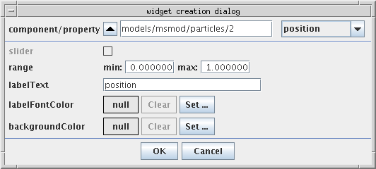
The top-most widget in this dialog is a component/property selector. The component section is a selection display identical in function to that described in Section 4.4: the path of the most recently selected component is displayed, and its parent may be selected by clicking on the ``up'' button at the left. If no component is selected, you will need to select one using the navigation panel or the viewer. Once a component is selected, the combination box on the right will provide a selection of properties that may be selected for the widget. Once a property is selected, other options in the dialog may be used to tune the appearance of the widget:
- slider
-
Enabled for properties with a scalar numeric value. Setting it to true will create a widget with a slider.
- range
-
Specifies the range for the slider, if one is selected.
- labelText
-
The name of the widget in the panel. By default, this is the name of the property.
- labelFontColor
-
Font color for the widget name. If null, then the default color is used.
- backgroundColor
-
Background color for the widget. If null, then the default background is used.
12.1.1 Composite property widgets
A CompositeProperty is a Property which contains sub-properties. If a composite property is selected, the control panel will create a composite property widget, three of which are shown in Figure 31.
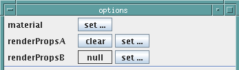
Clicking the set button of a composite property widget will create another panel presenting all the sub-properties. The composite property widget is disabled until this panel is closed.
In some instances, a composite property can be set to null. In such cases, the widget will provide an additional component, which
12.1.2 Widgets for sub-properties
It is possible to attach widgets to the sub-properties of a composite property, provided that the composite property has a non-null value.
In particular, when a non-null composite property is selected from the component/property widget, the user has the option of either
-
•
clicking the Done button and selecting the composite property, which will create a composite property widget as described in the previous section, or
-
•
selecting one of the composite property’s sub-properties.
When a non-null composite property is selected, the property’s name will move over into the component field of the component/property selector, and the combination box will be cleared and reset to allow the selection of the sub-properties.
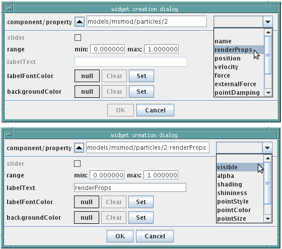
For example, in Figure 32, we first select renderProps, which is a composite property of models/msmod/particle/2, and then (in the lower panel) select the sub-property visible. When renderProps is selected, its name is moved to the component panel, where it appears as
models/msmod/particle/2:renderProps
Note:
The ‘:’ character is used to separate components from properties in component/property paths
12.2 Editing Control Panels
An existing control panel can also be edited. Specifically,
-
•
Individual widgets can be moved, deleted, or have their properties set.
-
•
Separators can be added between widgets.
-
•
Global aspects of the control panel itself can be set.
To edit an individual widget, you first select it by left-clicking on it. This will cause it to become highlighted. You can then:
-
•
Move the widget by dragging it to a different vertical location within the panel;
-
•
Delete the widget by right-clicking and choosing delete;
-
•
Set properties of the widget by right-clicking and choosing properties;
To add a separator, select a widget above where you want the separator, right-click and choose add separator.
To set global aspects of the control panel itself, right-click inside the lower-most option pane (the small panel at the bottom and that may, in some cases, contain option buttons such as Close or Done), and choose from the provided menu.
12.3 Live Updating
By default, a control panel is set up to update the values of its widgets every time the viewers are rerendered. This allows one to observe property values as they evolve in time.
If you do not want live updating of property values, then you can
disable this by clicking on the live update icon
, which is located in the lower left of the
option panel.
13 Component Editing
Component editing in ArtiSynth is driven by the current selection context: depending on what items are currently selected, different editing options will appear in the context menu. These options may allow you to add, edit, or delete components.
13.1 Generic Edit Operations
13.1.1 Deletion
A set of selected components can be deleted provided that
-
•
their parent components are editable
-
•
none of their ancestors are selected
If the currently selected components are deletable, then a delete option will appear in the context menu (obtained by right-clicking in the viewer or navigation panel). Selecting this will delete the components.
If the selected components are referred to by other components, then those components will be deleted also. In this case, a dialog will be presented to the user advising of this fact and requesting confirmation.
13.1.2 Duplication
A set of selected components may be duplicated provided that
-
•
their parent components are editable
-
•
none of their ancestors are selected
-
•
they implement CopyableComponent
If the currently selected components are duplicable, then a duplicate option will appear in the context menu. Selecting this will enable duplication of the components: the viewer cursor will change to cross-hairs, and the user may indicate the location for the duplicated components by left-clicking in the viewer (see Section 3.7). Duplication may be canceled by right-clicking.
Sometimes, when the components to be duplicated refer to other components, those referred components will be duplicated also. This is done when the referred components are required. For example, when duplicating an AxialSpring, the two points it is attached to will also be duplicated, because AxialSprings are not permitted to exist without attached points. Such cases are indicated to the user, after the duplicate option has been selected, by expanding the current selection to include all such additional components.
13.1.3 Undo
Many of the operations described here are undoable, by choosing the Undo option from the Edit menu. The menu option will indicate the name of the operation to be undone. Hitting the ‘z’ key from within the viewer (Section 3.9) will also perform undo operations.
13.2 Editing Panels
Many editing operations involve the creation of editing panels (such as Figure 35, etc.) which persist beyond the invocation of a context menu. Often, these panels are created exclusively, so that only one can be in existence at once. This is done by having the panel acquire a lock in the ArtiSynth editing manager. The panels are not modal, so the user can still interact with the viewer and other GUI components, but other exclusive editing panels can not be created until the current one is closed. This avoids problems associated with having two ``edits'' active on a the model at once.
If an exclusive editing panel is open, then other exclusive editing options will still be shown in the context menu but will be disabled.
13.3 Specifying Position, Orientation, and Scaling
Sometimes, an editing panel will allow you to specify the translation and rotation associated with a RigidTransform3d. Typically, this will happen when there is a need to specify the location of a spatial coordinate frame, as in the example of Figure 33.

Here, the translation and rotation correspond to the fields position and orientation. The position field is straightforward: it is just three numbers giving the position of the coordinate frame origin with respect to the base (usually world) coordinates. In Figure 33, this is the vector (1, 2, 3).
The orientation field is more complex. It corresponds to the rotation of the coordinate frame with respect to base coordinates, and is represented using an axis-angle format of four numbers giving the axis of the rotation, followed by the angle of rotation about this axis, in degrees. (This relies on the fact that any 3D rotation can be specified as a single rotation about a single axis.) Hence the numbers
0 1 0 60
in Figure 33 correspond to a rotation of 60 degrees about the y axis. Alternatively, the numbers
1 1 0 45
would correspond to a rotation of 45 degrees about the axis (1, 1, 0). (Note that the axis does not need to be a unit vector.) Finally, no rotation, or more precisely, the identity rotation, is usually represented as
1 0 0 0
i.e., zero rotation about the x-axis. In more general situations, one may specify not only translation and rotation but also scaling, corresponding to a more general AffineTransform3d. This often occurs when reading a mesh from a file: one may wish to apply an affine transform to scale, rotate, and translate the mesh that is been read in. In such cases one will also be presented with a scale field, which accepts either a single number (to denote uniform scaling), or three numbers (to denote non-uniform scaling about the x, y, and z axes).
13.4 Editing MechModels
A MechModel is the central ArtiSynth component for mechanical simulation. It contains sets of mechanical components, including particles, rigid bodies, axial springs, rigid body connectors, as well as sub-models including other MechModels and finite element (FEM) models. Most of these components can be added to a MechModel graphically, as described below.
To add a component to a MechModel, select the MechModel and choose the appropriate edit action shown in the context menu. A MechModel cannot be selected in the viewer, but can be selected using the navigation panel (Figure 8), or by first selecting one of its visible components in the viewer and navigating up the hierarchy to it using the up arrow of the selection display (Section 4.4).
13.4.1 Adding finite element models
To add a FemModel to a MechModel, select the MechModel and choose "Add FemModel ..." in the context menu. This will open the editing panel shown in Figure 35, which allows the user to provide information about the model’s properties and geometry.
Default values are provided for almost all of this information; the only information that must be specified by the user is the model’s position (corresponding to the origin of it’s volumetric mesh). This can be done either by left-clicking in the viewer (Section 3.7), or by entering coordinates in the position field of the Location subpanel. Once a position is specified, a wireframe preview of the FEM appears in the viewer (Figure 34), showing its geometry and allowing it to be moved or rotated using an attached transformer. The user is then free to continue editing the properties and geometry information, until the model is in the desired form, at which point it can be added to the MechModel by clicking the Add button.

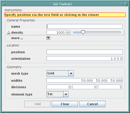
From top to bottom, the FemModel panel contains:
-
•
An instruction box containing directions for the user.
-
•
A General Properties subpanel, which allows the user to set properties for the FemModel. For brevity, some of these properties are hidden and can be expanded by clicking the more... button.
-
•
A Location subpanel, allowing the position and orientation to be set manually. The position corresponds to the mesh origin, while the orientation is a rotation applied to the mesh, specified in axis-angle format (see Section 13.3).
-
•
A Geometry panel, allowing specification of the mesh geometry type and various properties specific to this type. Mesh types currently supported include Grid, Tube, Torus, Sphere, Extrusion, AnsysMesh, TetgenMesh and UCDMesh. For many of these, the associated element type can also be specified: Tet (tetrahedron), Hex (hexahedron), QuadTet (quadratic tetrahedron), QuadHex (quadratic hexadredron), and Wedge.
-
•
An option panel, containing the Add button, a Clear button which resets the displayed fields to default values, and a Cancel button which closes the panel without adding a FemModel.
13.4.2 Adding rigid bodies
To add a RigidBody to a MechModel, select the MechModel and choose "Add RigidBody ..." in the context menu to open an editing panel for rigid bodies, as shown in Figure 36.
As with adding FEM models, default values are provided for most information; the user must only specify the body’s position, either by left-clicking in the viewer (similar to Section 3.7), or by entering coordinates in the position field of the Location subpanel. Once a position is specified, a wireframe preview of the rigid body appears in the viewer (Figure 34), showing its geometry and allowing it to be moved or rotated using an attached transformer. The user is then free to continue editing the properties, geometry and inertia information, until the model is in the desired form, at which point it can be added to the MechModel by clicking the Add button.
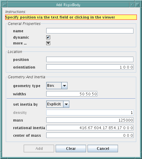
From top to bottom, the Add RigidBody panel contains:
-
•
An instruction box containing directions for the user.
-
•
A General Properties subpanel, which allows the user to set properties for the body. For brevity, some of these properties are hidden; the panel can be expanded by clicking the more... button.
-
•
A Location subpanel, allowing the position and orientation of the body’s coordinate system to be set manually. Position is specified as a three-vector, while the orientation is given as a rotation in axis-angle format (see Section 13.3).
-
•
A Geometry And Inertia subpanel, which allows the user to specify the body’s surface mesh geometry and spatial inertia, using the same type of panel as described in Section 13.5.1.
-
•
An option panel, containing the Add button, a Clear button which resets the displayed fields to default values, and a Cancel button which closes the panel without adding a rigid body.
13.4.3 Adding frame markers
A FrameMarker is a massless Point attached to a RigidBody. It can be used for tracing motions of that body, or as an anchor point for attaching axial springs or other components.
To add one or more frame markers to the rigid bodies in a MechModel, you can select either the MechModel, or one of its rigid bodies, and then choose "Add FrameMarkers ..." in the context menu. This will open a FrameMarker editing panel, as shown in Figure 37. While this panel is open, frame markers can be added by using the viewer and left-clicking the mouse over the surface mesh of the rigid body at the location where you want the marker to be placed (see Section 3.7). The rigid body in question must belong to the MechModel that was originally selected; no marker will be added to bodies that belong to another MechModel or a MechModel which is a submodel of the current one.
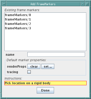
From top to bottom, the FrameMarker editing panel contains
-
•
An Existing frame markers list, showing all the MechModel’s frame markers (expressed by their path names with respect to the MechModel). This list is connected to the selection manager and can be used to select one or more markers.
-
•
A name field that allows a name to be specified for the marker.
-
•
A Default marker properties panel, which allows the user to set properties for subsequent FrameMarkers that are added.
-
•
An instruction box containing directions for the user.
-
•
An option panel, which in this case contains a Done button which the user should click when finished.
13.4.4 Adding particles
A Particle is a dynamic component, with mass, derived from Point. It is usually connected to other components in a model with either axial springs (Section 13.4.5) or point-to-point attachmennts (Section 13.4.7).
To add one or more particles to a MechModel, select the MechModel in question and choose "Add Particles ..." in the context menu. This will open a Particle editing panel, as shown in Figure 38. While this panel is open, a particle can be added by left-clicking the mouse in the viewer at the location where you want the particle to be placed, using the constrain to plane option if necessary (see Section 3.7).
From top to bottom, the Particle editing panel contains
-
•
An Existing particles list, showing all the MechModel’s particles (expressed by their path names with respect to the MechModel). This list is connected to the selection manager and can be used to select one or more particles.
-
•
A name field that allows a name to be specified for the particle.
-
•
A Default particle properties panel, which allows the user to set properties for subsequent particles that are added. For brevity, some of these properties are hidden; the panel can be expanded by clicking the more... button.
-
•
An instruction box containing directions for the user.
-
•
A constrain to plane option.
-
•
An option panel, which in this case contains a Done button which the user should click when finished.
13.4.5 Adding axial springs and muscles
An AxialSpring is a point-to-point force effector that connects two Points and effects a force between them based on their separating distance. AxialSprings and its subclasses can be used to implement linear or nonlinear springs, as well as the subclass Muscle used to implement two-point muscles.
To add one or more axial springs to a MechModel, select the MechModel in question and choose "Add AxialSprings ..." in the context menu. This will open an AxialSpring editing panel, as shown in Figure 39. While this panel is open, axial springs can be added by selecting (using the viewer or any other selection mechanism) the two points to which the spring is attached. Points may include frame markers, particles, or FEM nodes. However, the points must be contained within the MechModel or one of its submodels.
By default, two points must be selected, in succession, for each axial spring added. Alternatively, by selecting add continuously at the bottom of the panel, a continuous sequence of spings will be created whereby the second point selected for a given spring becomes the first point for the spring following it.
From top to bottom, the AxialSpring editing panel contains
-
•
An Existing axial springs list, showing all the MechModel’s springs (expressed by the path names, with respect to the MechModel, of their points). This list is connected to the selection manager and can be used to select one or more springs.
-
•
A name field that allows a name to be specified for the spring.
-
•
A Spring type field that allows a specific subclass of AxialSpring to be selected.
-
•
A Default properties panel, which allows the user to set properties for subsequent springs that are added. The properties in question vary depending on the type selected in the Spring type field. For brevity, some properties may be hidden, in which case the panel can be expanded by clicking the more... button.
-
•
A progress field displaying the path names of the points as they are selected.
-
•
An instruction box containing directions for the user.
-
•
An add continuously option as described above.
-
•
An option panel, containing an Add/Stop button which is used to initiate or stop the addition of springs, and a Done button which the user should click when finished.
13.4.6 Adding rigid body connectors
A BodyConnector is a component that implements constraint-based joints between either two rigid bodies, or between one rigid body and ground. The GUI currently allows two types of joints to be added: spherical and revolute.
To add one or more rigid body connectors to a MechModel, select the MechModel in question and choose "Add RigidBodyConnectors ..." in the context menu. This will open a RigidBodyConnector editing panel, as shown in Figure 40. While this panel is open, a connector can be added by selecting in succession (using the viewer or any other selection mechanism) the rigid bodies associated with it. For the case of a single rigid body connected to ground, the user clicks the Fixed button instead of selecting a second body.
After the bodies have been selected, the connector location must then be specified by left-clicking in the viewer (Section 3.7). By default, the orientation of the connector is aligned with the world axes. This can be adjusted later using the dragger fixtures (Section 5.1).
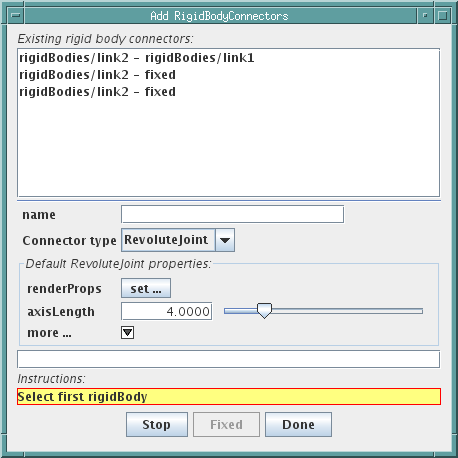
From top to bottom, the RigidBodyConnector editing panel contains
-
•
An Existing rigid body connectors list, showing all the MechModel’s connectors (expressed by the path names, with respect to the MechModel, of their rigid bodies). This list is connected to the selection manager and can be used to select one or more connectors.
-
•
A name field that allows a name to be specified for the connector.
-
•
A Connector type field that allows a specific connector type to be selected.
-
•
A Default properties panel, which allows the user to set properties for subsequent connectors that are added. The properties in question vary depending on the type selected in the Connector type field. For brevity, some properties may be hidden, in which case the panel can be expanded by clicking the more... button.
-
•
A progress field displaying the path names of the rigid bodies as they are selected.
-
•
An instruction box containing directions for the user.
-
•
An option panel, containing an Add/Stop button which can be used to initiate or stop the addition of connectors, a Fixed button used to indicate when a rigid body is to be connected to ground, and a Done button which the user should click when finished.
13.4.7 Attaching particles to particles
Within a MechModel, two particles or FEM nodes can be attached together, resulting in what is essentially a single particle that combines the dynamics of both original particles. In particular, these particle attachments are a convenient way to connect FEM models to other FEM models or to particles within a MechModel.
To attach particles contained within a MechModel, select the MechModel in question and choose "Attach particles ..." in the context menu. This will open a ParticleAttachment panel, as shown in Figure 41. While this panel is open, pairs of particles can be attached by selecting in succession (using the viewer or any other selection mechanism) the two particles to be connected.
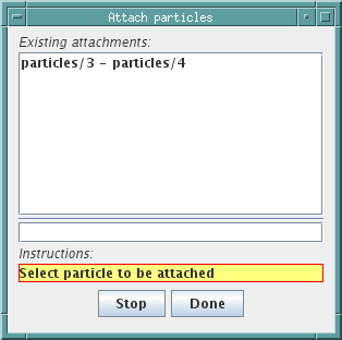
From top to bottom, the ParticleAttachment panel contains
-
•
An Existing attachments list, showing all the MechModel’s attachments (expressed by the path names, with respect to the MechModel, of their particles). This list is connected to the selection manager and can be used to select one or more attachments.
-
•
A progress field displaying the path names of the particles as they are selected.
-
•
An instruction box containing directions for the user.
-
•
An option panel, containing an Attach/Stop button which can be used to initiate or stop the attachment process, and a Done button which the user should click when finished.
13.4.8 Attaching particles to rigid bodies
Within a MechModel, particles and FEM nodes can also be attached to rigid bodies. In particular, this provides a way to connect FEM models to rigid bodies within a MechModel.
To attach particles to a rigid body, select the rigid body in question and choose "Attach particles ..." in the context menu. This will open a ParticleRigidBodyAttachment panel, as shown in Figure 42. While this panel is open, particles can be attached to the body by selecting them in succession. By default, the attached particles remain where they are, so that the attachment point is determined by the current particle location relative to the rigid body’s coordinates. However, this will typically not coincide with the body’s surface mesh. By selecting project points onto body at the bottom of the panel, attached points will be relocated to the nearest location on the surface mesh as they are selected.
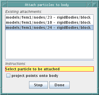
From top to bottom, the ParticleRigidBodyAttachment panel contains
-
•
An Existing attachments list, showing all the MechModel’s particle to rigid body attachments (expressed by the path names, with respect to the MechModel, of the particles and the bodies). This list is connected to the selection manager and can be used to select one or more attachments.
-
•
A progress field displaying the path names of the particles as they are selected.
-
•
A project points onto body field, described above.
-
•
An instruction box containing directions for the user.
-
•
An option panel, containing an Attach/Stop button which can be used to initiate or stop the attachment process, and a Done button which the user should click when finished.
13.4.9 Collision handling

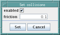
In ArtiSynth, collision detection and handling can be enabled between rigid bodies (such as RigidBody), deformable bodies (such as FemModel3d), and more generally any body that implements the interface Collidable. Self intersection is not directly supported, but is indirectly supported for compound deformable bodies that contain sub-collidable components. For example, an FEM model is a compound collidable that may contain multiple surface meshes, some of which can be made to collide with each other. For more details on collision handling, see the ``Collision Handling'' section of the ArtiSynth Modeling Guide.
The collision response between any two pairs of bodies is determined by a CollisionBehavior component, which contains various properties controlling collision interactions. Two of these can be directly modfied from the GUI:
- enabled
-
whether or not collisions are enabled;
- friction
-
the friction coefficient if collisions are enabled.
Collisions handling is managed by a CollisionManager component within each MechModel. Each MechModel provides four default behaviors that determine the default collision response for (a) rigid body pairs, (b) rigid-deformable body pairs, (c) deformable body pairs, and (d) deformable self-intersection. In addition to these, override collision behaviors can be specified for any pairs of bodies. In situations where a MechModel contains sub-MechModels, then the collision behavior for any pair of collidables is controlled by the lowest MechModel in the hierarchy that contains both.
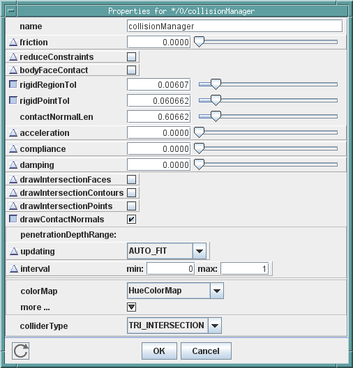
There are several ways to edit collision behavior using the GUI.
-
•
For default behaviors, the enabled and friction properties can be edited by selecting the MechModel and then choosing "Set default collisions ..." from the context menu. This will open the dialog shown in Figure 43, allowing the enabled and friction properties to be adjusted. For the example shown, collisions are enabled between all rigid bodies, with a friction coefficient of 0.2, and between all rigid and deformable bodies, with a coefficient of 0.1. Other collisions are disabled.
-
•
If a user selects a particular set of rigid and/or deformable bodies, a specific collision behavior may be established among those bodies by choosing "Set collisions ..." from the context menu. That will open the dialog shown in Figure 44, allowing the enabled and friction properties for this behavior to be set.
-
•
If a user selects a single deformable body, a specific self-intersection behavior for that body may be established by selecting "Set self collision ...".
-
•
More detailed collision control can be realized by selecting the MechModel’s collision manager in the navigation panel (Section 4.2). Choosing Edit properties ... or Edit render props ... from the right context menu then allows other properties to be set to control either the collision behavior or the rendering of collisions. A sample property panel is shown in Figure 45, and these properties are described in the ``Collision Handling'' section of the ArtiSynth Modeling Guide
-
•
For more fine-grained control, one may also use the navigation panel to select one or more of the behavior components located under the collision manager (see Figure 46). The first four of these control the default behaviors. Other behaviors, if any, are overrides that have been added either by application code, or through the GUI. Once selected, one can choose Edit properties ... or Edit render props ... from the right context menu to edit their properties. In the case of override behaviors, the context menu can also be used to remove them.
-
•
Finally, all override behaviors in a specific MechModel may be removed by selecting "Remove collision overrides". This will cause the collision behavior for all bodies to revert to default values.
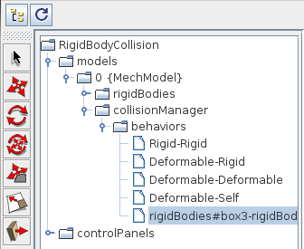
13.5 Editing Rigid Bodies
The GUI provides some ability to edit rigid bodies, (type RigidBody), the most important of which allows the user to edit its mesh geometry and inertia (see Section 13.5.1). If a rigid body is selected, the context menu will provide the following options:
- Add FrameMarkers ...
-
Allows FrameMarkers to be added to the rigid body (see Section 13.4.3).
- Select markers
-
Causes all markers attached to the rigid body to be selected.
- Save mesh as ...
-
Allows the surface mesh to be saved as an Alias Wavefront .obj file.
- Edit geometry and inertia ...
-
Change the mesh geometry and/or inertia (see Section 13.5.1, below).
- Attach particles ...
-
Allows particles to be attached to the rigid body (see Section 13.4.8).
13.5.1 Geometry and inertia
Choosing "Edit geometry and inertia ..." in the context menu for a rigid body opens a geometry and inertia panel, as shown in Figure 47.
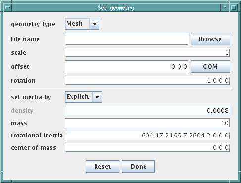
The upper part of the panel allows the user to set the mesh geometry, according to a type specified by the geometry type field. Changing the geometry type changes the panel to include fields for setting parameters appropriate to the type. Currently supported types include:
- Box
-
An axis-aligned box, centered with respect to body coordinates, with the x, y, and z widths set by three numbers in a widths field.
- Sphere
-
A sphere, centered with respect to body coordinates, with the radius and the number of vertical mesh slices given by fields radius and slices.
- Mesh
-
A mesh read in from an Alias Wavefront .obj file, whose name is specified by a file name field. The read mesh can also be scaled, offset, and rotated using information provided by scale, offset, and rotation fields (see Section 13.3). The COM button causes the mesh to be offset so that its center of mass (assuming unform density) is coincident with the origin of the body’s coordinate system (also causing the location of the center of mass to become zero).
Note:
At present, there appears to be a bug in the code that compute inertia from geometry, producing small errors in the center of mass calculation. That means that hitting the COM button will not cause the center of mass to become zero, but instead a small number that will converge to zero if COM is hit repeatedly.
The lower part of the panel sets the body’s spatial inertia. Spatial inertia for a rigid body can be set in three ways, corresponding to the value of the body’s inertiaMethod property:
- Density
-
The spatial inertia is calculated from the density and the surface mesh geometry, with the assumption that the density is uniform.
- Mass
-
The spatial inertia is calculated from the mass and the surface mesh geometry, with the assumption that the density is uniform. The density is computed by dividing the mass by the mesh volume.
- Explicit
-
The spatial inertia is explicitly specified by entering values in the mass, inertia, and center of mass fields. The density is set to the average value obtained by dividing the mass by the mesh volume.
The inertia method can be set using the set inertia by field. Four other fields describe properties associated with the spatial inertia itself:
- density
-
The mass divided by the volume
- mass
-
The scale mass of the body
- rotational inertia
-
The xx, yy, zz, xy, xz, and yz components of the rotational inertia tensor about the center of mass in body coordinates
- center of mass
-
the position of the center of mass with respect to body coordinates.
Depending on the inertia method, the contents of these fields are either set by the user or updated automatically.
13.6 Editing FEM Models
The GUI also provides some ability to edit FEM models (type FemModel3d). If an FEM model is selected, the context menu will provide the following options:
- Add FemMarkers ...
-
Allows the user to add marker points to the FEM, as described in Section 13.6.1.
- Rebuild surface mesh
-
Rebuilds the surface mesh for the FEM. The surface mesh is computed automatically from the faces of all the elements, with inside faces being removed. Also, any elements which are fully or partly obscured by an active clipping plane are removed from the calculation, making it possible to create "partial" surface meshes that provide a cutaway view of the model.
- Save surface mesh ...
-
Allows the current surface mesh to be saved to an Alias Wavefront .obj file.
- Save mesh as ANSYS file ...
-
Allows the FEM volumetric mesh to be saved using the ANSYS file format.
13.6.1 Adding FEM markers
A FemMarker is a massless Point attached to a specfic FemElement3d. It can be used for tracing motions within that element, or as an anchor point for attaching axial springs or other components. It is analagous to a FrameMarker for FEM elements.
To add one or more markers to an FEM model, you can select the FEM model in question and then choose "Add FemMarkers ..." in the context menu. This will open a FemMarker editing panel, as shown in Figure 48. While this panel is open, FEM markers can be added by left-clicking the mouse in the viewer over the location where you want the marker placed, using the constrain to plane option if necessary (see Section 3.7). An FEM marker is then created and attached to the nearest element in the FEM. If the marker position is outside the FEM, it is projected onto the closest point on the FEM surface.
In addition, the button Add Amira Landmarks allows a user to add a set of markers based on locations in an Amira landmark file.

From top to bottom, the FemMarker editing panel contains
-
•
An Existing markers list, showing all the FEM’s frame markers (expressed by their path names with respect to the FEM). This list is connected to the selection manager and can be used to select one or more markers.
-
•
A name field that allows a name to be specified for the marker.
-
•
A Default marker properties panel, which allows the user to set properties for subsequent markers that are added.
-
•
An instruction box containing directions for the user.
-
•
A constrain to plane option.
-
•
An option panel, containing an Add Amira Landmarks button, described above, and a Done button which the user should click when finished.
13.6.2 Adding muscle bundles
FemMuscleModel is a subclass of FemModel3d that supports muscle activation. A FemMuscleModel may contain muscle bundles (type MuscleBundle), each of which is composed of fibres and elements. The fibres are two-point muscles connecting nodes or markers within the FEM model, with activation provided by forces acting directly on the fibre end points. The elements are a set of references to existing elements within the FEM model, each combined with an activation direction. Each element reference within the bundle provides muscle activation behavior by superimposing a transversely isotropic material behavuor on top of the underlying element’s material behavior.
Activation of a MuscleBundle can be effected by either the fibres or the elements, with the latter generally providing a superior simulation result. By default, the fibres are inactive, and are used simply to provide a good visual indication of the activation directions within the model, and a way to automatically compute the referenced elements and their directions (as described below). To make the fibres active, set the bundle’s fibresActive property to true. Conversely, to make the elements inactive, set the bundle’s muscleMaterial property to InactiveMuscle.
To add a MuscleBundle to a FemMuscleModel, select the model and then choose "Add MuscleBundle ..." from the context menu. This will immediately add a MuscleBundle to the model, and then open a MuscleFibre editing panel (see Section 13.7.1) to allow the user to add fibres to the model. The panel also contains two extra fields at the top: bundle name, allowing a name to be specified for the bundle, and bundle renderProps, allowing its render properties to be adjusted. At present, the panel does not contain a Cancel option. To remove the MuscleBundle, either select and delete it, or choose "Undo add MuscleBundle" from the Edit menu.
13.7 Editing Muscle Bundles
Existing muscle bundles can be editing to add or remove fibres or element references.
13.7.1 Adding fibres
Fibres can be added to a MuscleBundle by selecting the bundle and then choosing "Edit fibres ..." from the context menu. This will open a MuscleFibre editing panel as shown in Figure 49.
The operation of this panel is essentially identical to the AxialSpring editing panel described in Section 13.4.5: fibres are added by successively selecting the points (which in this case must be FEM nodes or markers) which serve as the endpoints for the fibres in question.

The only difference from the AxialSpring panel is that the spring type is assumed to be a Muscle and there is no option to change this.
13.7.2 Adding element references
Elements can be added to a MuscleBundle by selecting the bundle and then choosing "Edit elements ..." from the context menu. This will open a MuscleElement editing panel as shown in Figure 50.
The operation of this panel is quite simple: one selects the elements that one wishes to add, and then clicks on the Add button to add them to the bundle. Elements which are already contained in the bundle will be excluded. Viewer-based element selection is described in more detail below.
From top to bottom, the MuscleElement editing panel contains
-
•
A list of element references already associated with the bundle (expressed by the elements’ path names with respect to the FEM muscle model). To remove element references from the bundle, one may select them in this list and then choose "Delete" from the context menu. It should be noted that this deletes the references for the elements within the bundle, and not the elements themselves from the FEM model.
-
•
Fields modelElementSize and bundleElementSize which control the size of the element widgets which are rendered for both the FEM muscle model and the bundle, as described below.
-
•
An instruction box containing directions for the user.
-
•
An option panel, containing an Add button which adds selected elements to the bundle, and a Done button which the user should click when finished.
Element selection is often done by clicking on an element widget in the viewer. An element widget is a simplified solid rendering of an element’s shape, with a size that varies from 0 to 1, with 0 being invisible and 1 being the full size of the element. Element widgets can be rendered for all the elements in an FEM model, with a size controlled by the model’s elementWidgetSize property. In addition, separate widgets can be rendered for the all the elements referenced by a muscle bundle, with a size controlled by the bundle’s elementWidgetSize property. In order to be able to see and select both the referenced elements in a bundle, and the other elements in the FEM model, one should set elementWidgetSize for the bundle and the model to values greater than zero, with the former larger than the latter. Figure 51 shows a simple example where referenced elements in a bundle are rendered using a widget size of 0.6, while the model elements themselves are rendered using a widget size of 0.5.
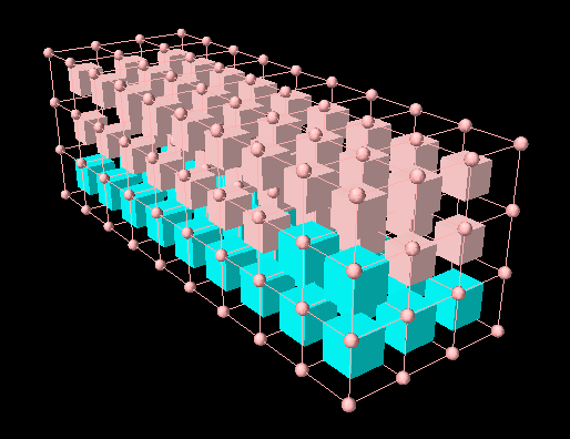
To facilitate element selection and visualization, the MuscleElement panel temporarily sets elementWidgetSize to 0.6 for the bundle and 0.5 for the FEM model. These values can then be adjusted as needed.
13.7.3 Automatically Setting Elements and Directions
Since manually selecting elements and specifying their directions for a muscle bundle can be quite tedious, a number of methods exist to help do this automatically, using the easier-to-visualize information supplied by the muscle fibres. From the MuscleBundle context menu, one may select:
- Compute element directions
-
Automatically computes directions for all referenced elements, using a Delaunay-based interpolation of the directions of the fibres which are closest to them.
- Add elements neat fibres ...
-
Automatically adds to the set of referenced elements all elements whose centers are within a prescribed distance of one or more of the fibres.
- Delete elements
-
Deletes all the element references for the bundle.
13.7.4 Removing fibres and element references
To remove specific fibres or element references, simply select them (using any of the selection mechanisms), and the choose "Delete" from the context menu.
13.8 Editing Muscle Exciters
A MuscleExciter is a component that allows muscle excitation signals to be distributed to a set of target ExcitationComponents. Excitation components include anything that can receive a muscle excitation, including point-to-point muscles, muscle bundles, and other muscle exciters. The purpose of a muscle exciter is to facilitate grouping so that one excitation signal can drive a number of underlying components. They can be optionally added to both MechModels and FemMuscleModels, where they are stored in a component list called exciters.
The GUI provides the ability to edit the targets associated with a given exciter. To do this, select the exciter in question, and then choose "Edit targets ..." in the context menu. This will open an ExcitationTarget panel, as shown in Figure 52.
To add a new excitation target, select the desired excitation component (using any of the selection mechanisms), and it will be added to the list of existing targets. Each target is also associated with a gain, by which the excitation signal is multiplied as it is passed on to the target. Gains can be edited using the numeric field in the list of targets. Finally, to remove a target, simply select it in the list of targets, and choose "remove targets" from the context menu.
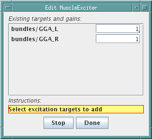
From top to bottom, the ExcitationTarget panel contains
-
•
An Existing targets list, showing all the current targets, allowing them to be selected for removal or their gains to be edited.
-
•
An instruction box containing directions for the user.
-
•
An option panel, containing an Add/Stop button which can be used to initiate or stop the adding of targets, and a Done button which the user should click when finished.
13.9 Editing Root Models
Some very limited graphical editing is available for RootModels. It is possible to add a MechModel to the RootModel, by selecting the RootModel and then choosing "Add MechModel ..." in the context menu. This brings up a MechModel editing panel as shown in Figure 53.
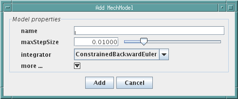
The panel is quite simple: you edit the MechModel properties to the appropriate settings, click the Add button, and a new MechModel is added. However, this is of limited use, since normally only one MechModel is placed directly under the RootModel, as multiple MechModels cannot be advanced using the same integrator and must therefore be completely decoupled.
14 Customizing the Models Menu
The Models menu is automatically created at run-time. By default, it has the format described in Section 2.1 However, it is possible to supply an alternative Models menu either of the following command-line parameters:
- -demosFile <filename>
-
Specifies a flat list of models to be loaded, using a plaintext format.
- -demosMenu <filename>
-
Specifies a menu that may contain hierarchies, separators, and icons, using an XML format.
A description of both file formats are provided in the following sections.
14.1 Plaintext Format
In the plaintext format, entries are listed as title-class pairs, separated by whitespace. Lines beginning with a hash (#) are ignored. Titles containing spaces must be surrounded by quotation marks. The following is an example:
14.2 XML Format
The XML format was designed to give users more control over the appearance of the menu. An XML schema is provided that describes and enforces the required document structure (src/artisynth/core/modelmenu/modelmenu.xsd). The following XML elements are defined:
| ModelMenu: | the root element of the document |
| model: | specifies a model that can be loaded |
| separator: | inserts a horizontal line that separates entries |
| label: | inserts an inactive text entry |
| menu: | creates a sub-menu |
| package: | finds and lists all models from a specified Java package |
| demosFile: | imports all models from a file in plaintext format |
| history: | adds a set of recently loaded models |
| include: | imports a menu from another XML file |
| hidden: | convenience element for hidding menu entries (i.e. commenting them out) |
A detailed description of each of the element types and their supported attributes is provided in the next sections. Attributes marked by an asterix are required in the element definition. Some attributes, such as icon, refer to an external file location. The parser tries to find included files by searching directories in the following order:
-
•
The root directory (i.e. absolute path)
-
•
The local directory, relative to the XML file
-
•
All directories listed in ARTISYNTH_PATH
The first readable file found is used.
14.2.1 The root element
The root element encapsulates the entire menu description. It must make reference to the schema for validation purposes. The following code snippet can be used as a template for creating a new menu file.
Note:
The second value of schemaLocation is the location of the schema file, which may need to be modified depending on its path relative to the current XML file.
14.2.2 Models
Individual models are inserted into the menu using a model element. These specify a class to load when the menu entry is selected. The model must be a sub-class of RootModel.
Attributes:
class*:
the class to load when the entry is selected
args:
command-line style arguments to be passed to the model
text:
the text to display in the menu (default: the class name)
icon:
filename of an icon (relative or absolute path)
fontname:
font family for the displayed text
fontstyle:
font style, from {"", "bold", "italic",
"bold italic"}
fontsize:
font size
The following snippet creates a menu entry titled "Muscle Arm", which will launch the model FemMuscleArm.
14.2.3 Separators
A separator is a horizontal line that visually separates menu entries. It can help distinguish groups of related menu items. The separator element has no attributes. The following snippet adds a separator line between models found in the artisynth.models.femdemos package and those in artisynth.models.inversedemos.
14.2.4 Labels
Labels are inactive text entries; they cannot be selected in the menu. They can be used to label a group of entries. To help distinguish a label from an active menu item, it is recommended to set the font style to "italic".
Attributes:
text*:
the text to display in the menu
icon:
filename of an icon (relative or absolute path)
fontname:
font family for the displayed text
fontstyle:
font style, from {"", "bold", "italic",
"bold italic"}
fontsize:
font size
In the following code snippet, a label is added before the tongue tracking models.
14.2.5 Sub-menus
Menu hierarchies can be created using the menu element. Apart from the root element, this is the only non-empty element type. It can contain any number of valid elements apart from the root element.
Attributes:
text*:
the text to display for the sub-menu
icon:
filename of an icon (absolute or relative path)
fontname:
font family for the displayed text
fontstyle:
font style, from {"", "bold", "italic",
"bold italic"}
fontsize:
font size
The following code snippet creates a sub-menu "FEM Models" with a specified icon, and lists all models found within the artisynth.models.femdemos package.
14.2.6 Packages
The package element can be used to include all models belonging to a particular Java package and its sub-packages. A base class can also be specified so that only models that are instances of that base class are added. For example to include all models that are sub-classes of HexTongueDemo, the following line can be used:
The models can be displayed in either a flat or hierarchical structure. To reduce the number of sub-menus, and to shorten some of the displayed text, a "compactness" level is introduced. Illustrative examples for the options are provided in Figure 54.
| compact | flat | hierarchical |
|---|---|---|
| 0 |  |
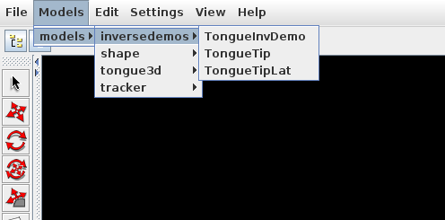 |
| 1 | 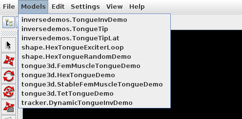 |
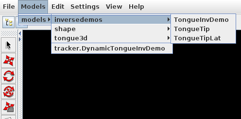 |
| 2 |  |
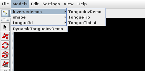 |
Attributes:
source*:
the package to search for models
base:
the base class from which all models must inherit
(default: RootModel)
args:
command-line style arguments to be passed to the models
view:
display format {"flat", "hierarchicial"} (default:
"hierarchical")
compact:
level of compactness {0, 1, 2} (default: 0)
0:
A new sub-menu is created for each sub-package (hierarchical),
displayed text refers to full package.class name relative
to source (flat)
1:
Sub-packages containing a single entity are merged into the
parent menu (hierarchical), displayed text refers to unique
part of the package.class name only (flat)
2:
Sub-packages containing a single entity are merged into the
parent menu (hierarchical) and displayed text refers to the
class name only (hierarchical/flat)
fontname:
font family for the displayed text
fontstyle:
font style, from {"", "bold", "italic",
"bold italic"}
fontsize::
font size
If font information is provided, it is applied to all entries.
The previous listing adds every single instance of RootModel found in the source tree to the menu. To get the menu to fit on the screen, compact="2" was used to strip away all package information from the displayed text, and a tiny font was applied to all entries.
Note:
The package element should be used sparingly for two main reasons:
- 1.
Each element adds to the ArtiSynth start-up time.
- 2.
Not all models are functional.
The reason for the start-up delay is that to populate the menu, the parser has to search through the supplied package, create an instance of each class, and test if it is a sub-class of base. The parser also has no way of detecting whether or not a model is functional, so all classes matching the criteria are added.
14.2.7 Plaintext files
The XML format supports loading models from a demosFile that uses the original plaintext format. Plaintext files have the advantage of being more human-readable, and are easier to edit/comment lines out. Models are listed in the current sub-menu.
Attributes:
file*:
plaintext file to load
fontname:
font family for the displayed text
fontstyle:
font style, from {"", "bold", "italic",
"bold italic"}
fontsize:
font size
The following line loads all models from the original default ArtiSynth Models menu.
If font information is provided, it is applied to all model entries that are created.
14.2.8 History
If model history tracking is enabled, then a set of recent items can
be added to the menu. To enable history tracking, pass the following command-line parameter to ArtiSynth on load:
-historyFile <filename>
The history element then specifies the number of most recently loaded
models to add to the history menu.
Attributes:
size:
number of recent models to add (default: "4")
fontname:
font family for the displayed text
fontstyle:
font style, from {"", "bold", "italic",
"bold italic"}
fontsize:
font size
14.2.9 Importing other XML files
To facilitate modularity, the include element can be used to import all menu content from another XML menu file. All elements contained within the root element of the included file are inserted into the current sub-menu.
Attributes:
file*:
XML file to import
The following code imports the contents from two different XML menu files, and separates them with a separator item.
14.2.10 Hiding Elements
It is often convenient to have the ability to "comment-out" lines in any kind of coding system: the data remains in the file, but has no effect when processed. The typical method for commenting in XML is to use the <!-- --> tags. Unfortunately, this can be messy, and comments cannot contain other comments. For this reason, a special hidden element was created. Any entries within a hidden element are ignored by the parser.
![[LOGO]](data:image/png;base64,iVBORw0KGgoAAAANSUhEUgAAAAsAAAAOCAYAAAD5YeaVAAAAAXNSR0IArs4c6QAAAAZiS0dEAP8A/wD/oL2nkwAAAAlwSFlzAAALEwAACxMBAJqcGAAAAAd0SU1FB9wKExQZLWTEaOUAAAAddEVYdENvbW1lbnQAQ3JlYXRlZCB3aXRoIFRoZSBHSU1Q72QlbgAAAdpJREFUKM9tkL+L2nAARz9fPZNCKFapUn8kyI0e4iRHSR1Kb8ng0lJw6FYHFwv2LwhOpcWxTjeUunYqOmqd6hEoRDhtDWdA8ApRYsSUCDHNt5ul13vz4w0vWCgUnnEc975arX6ORqN3VqtVZbfbTQC4uEHANM3jSqXymFI6yWazP2KxWAXAL9zCUa1Wy2tXVxheKA9YNoR8Pt+aTqe4FVVVvz05O6MBhqUIBGk8Hn8HAOVy+T+XLJfLS4ZhTiRJgqIoVBRFIoric47jPnmeB1mW/9rr9ZpSSn3Lsmir1fJZlqWlUonKsvwWwD8ymc/nXwVBeLjf7xEKhdBut9Hr9WgmkyGEkJwsy5eHG5vN5g0AKIoCAEgkEkin0wQAfN9/cXPdheu6P33fBwB4ngcAcByHJpPJl+fn54mD3Gg0NrquXxeLRQAAwzAYj8cwTZPwPH9/sVg8PXweDAauqqr2cDjEer1GJBLBZDJBs9mE4zjwfZ85lAGg2+06hmGgXq+j3+/DsixYlgVN03a9Xu8jgCNCyIegIAgx13Vfd7vdu+FweG8YRkjXdWy329+dTgeSJD3ieZ7RNO0VAXAPwDEAO5VKndi2fWrb9jWl9Esul6PZbDY9Go1OZ7PZ9z/lyuD3OozU2wAAAABJRU5ErkJggg==)